Our class was lucky enough to be welcomed into the design spaces of Anne M. Cramer, fashion designer, and Dan Woychick, graphic designer. I come from a back ground in graphic design and I intent to head in that direction but I was completely inspired by our visit with Anne Cramer. In my experience with graphic design I am working to meet a deadline and to please a client. In contrast with my experiences, I thought Anne’s process was interesting, she is able to create pieces according to her style and take her time developing new ideas, creating it exactly how she imagines. I was intrigued by her honest and humble personality, it’s obvious that she designs for the love of designing, and she admits that her style may not be everyone’s cup of tea, but that is what keeps things interesting.
Saturday, October 30, 2010
Thursday, October 28, 2010
Blog Project #4: FONTS. Michelle Stolz
Times New Roman:
1. I see a very basic font, that is very original and basic. It is on the verge of classy and casual, but not one more than the other.
2. It reminds me of english classes throughout my whole life, it is the font that teachers want to see and expect to see from students. It reminds me of late nights "cranking out" papers for various classes, from formal lab write ups to english research papers.
3. It makes me feel sullen, and looking at it makes me dread typing papers. In the words of Liz Lewis, "If I could murder (or kill) a font, it would be Times New Roman".
4. I feel that since it has been assigned the role of "the font for all papers", I feel that it is the permanent typeface for all papers, but in my opinion I dislike it strongly, but since i have been so used to it, it is definitely a love-hate relationship.

1. I see a very elegant, fine-line font that is very gestural and precise at the same time.
2. It reminds me of a romantic font, a font someone would use for an anniversary card or for a greeting card involved with a lot of meaning. It also reminds me of a formal invitation to a gathering that someone would receive in the mail, most likely for a wedding or a reception of some kind.
3. It makes me feel relaxed and formal, because the letters are so curved, free-flowing, connected, and vertical that the letters that make up a word feel unified.
4. This font can best be used in a formal letter or invitation. It can also be used to convey the message of romance or some sort of close relationship, even for a close friend that someone really cares about. I can also see this being very effective as the typeface for a high-end restaurant menu cover, as well as the sign outside the restaurant.

1. I see a very lively font, chipper and charismatic. It has expression and seems to be juvenile.
2. It reminds me of kids, because the curls at the end of each letter, and how the font does not follow straight lines, and the letters are not aligned straight, but skewed at an angle. It also reminds me of grade school, because this font was popular to use because it was unique at the time.
3. It makes me feel happy and chipper, because of the liveliness of the line of each letter, skewed, not aligned perfectly, and of course, the curls at the end of each letter.
4. In children's books, due to the fact that it's lively and intriguing for younger children, it can get them excited about reading and actually like reading, because if children like what they see, they will pursue it, and I believe this font can achieve that. Ii can also be used for children's videos, when font needs to be in there, for credits and opening title, because when I look at it, it reminds me of the font (somewhat) from the movie Monster's Inc. It is not the exact same font, but it screams juvenile.
Mining the Museum: Marina and Chuck
 Given the assignment of taking 3 works from the MIA and mixing them to form one exhibit; Chuck and I choseFrank Gehry's "Ribbon Chair", Lai Sung's "The Ship Fleetwing", and Egon Schiele's "Portrait of Paris von Gutersloh".
 The "Ribbon Chair" by Frank Gehry is breathtaking. It's sleek and modern with a warm honey color that contrasts the usual cool tones you see in contemporary architecture. We chose "The Ship Fleetwing" to the left of it, because it is calming and serene but at the same time it commands a lot of respect. It's a very powerful pai
nting and works well with the strong curving lines of the "Ribbon Chair". To the right is the "Portrait of Paris von Gutersloh" because of
the gestural quality to the painting. It has a lot of energy and excitement to it which plays off of the serene ship scene to the left.

The Ribbon Chair
By Frank Gehry
1992

The Ship Fleetwing
by Lai Sung
19th Century Asia

The Portrait of Paris von Gutersloh
By Egon Schiele
1918
Fonts: Garamond, Crunk Regular, and Black Cow
Garamond: I see a very clean font, utilizing sans serif. It is elegant, yet simple as well. I could see the typeface being employed for a clothing company, bakery, or wedding dress shoppe. The font is eye-pleasing, calm, and pleasant.

Crunk Regular: The font has a grunge-like feel, futuristic type of font. It actual reminds me of a post-apocalyptic society. The font makes one feel a little uneasy, but not horribly. The typeface would work well on an alien spaceship...for sure.

Black Cow: Of the three fonts posted, this is quite possibly the most bizarre of all. The letters appear to move, as if they were snakes; It makes one feel uneasy, horribly uneasy. The font would work for scaring off trespassers (signage), or if one wanted to upchuck.

Sources:
http://justcreativedesign.com/2008/09/23/top-7-fonts-used-by-professionals-in-graphic-design-2/
http://www.linotype.com/471675/crunk-family.html
http://www.ffonts.net/Black-Cow.font.download

Crunk Regular: The font has a grunge-like feel, futuristic type of font. It actual reminds me of a post-apocalyptic society. The font makes one feel a little uneasy, but not horribly. The typeface would work well on an alien spaceship...for sure.
Black Cow: Of the three fonts posted, this is quite possibly the most bizarre of all. The letters appear to move, as if they were snakes; It makes one feel uneasy, horribly uneasy. The font would work for scaring off trespassers (signage), or if one wanted to upchuck.

Sources:
http://justcreativedesign.com/2008/09/23/top-7-fonts-used-by-professionals-in-graphic-design-2/
http://www.linotype.com/471675/crunk-family.html
http://www.ffonts.net/Black-Cow.font.download
Designer Site Visits
The Anne Cramer and Dan Woychick visits were insightful because this 'field trip' showed us how real designers working in the Twin Cities produce their work and the process of creation in their different fields. What I found most interesting when we visited Anne was how she had always had a drive to create her own clothes and she knows how to promote her work. I also like how she designs the clothes then will keep revising it until she has the final product, instead of starting out sketching designs and measuring them. At Dan's studio the most interesting thing I learned was that his process in creating each design, he 'seeks out questions' then finds answers.
Fonts: Fat Marker, Ver Army, and Estrya's Handwriting

In this font, it is all black bubble letters with lines going through the letters all the way. It is a somewhat sloppy font, but that also makes it more fun or entertaining. None of the letters that have "holes" in them, (i.e. P, O, A etc) have the "holes" in this font either, which makes it pretty different. For some reason, this font reminds me of "School House Rock;" I can see all the letter going across the screen in this font. This font makes me feel very youthful; doodling on your notebook, passing notes in class, not paying attention to the teacher kind of youthful. So for the best use for this font, that would probably be something for kids. As in some sort of text on a school notebook or folder, or maybe the text on a movie poster made for kids

This font is very stencil-y. The letters are all separated from each other somehow, just how they make stencils. This font reminds me of a very old world sort of style. The way the font is portrayed in the image makes me think of the story of Anne Franke in the holocaust. Looking at this font, I can see it splattered across the walls of buildings as graffiti, with the Franke family running along side it, away from the soldiers. I think that this font would work for something like that very well; an old story scene in a movie or a TV show.

I see a very fluid type in this image. They way the letters are curved, as well as sharp points from the first letter, leading you to the second one, this type is very reminiscent of handwriting. The way the letter E, capitalized, is in the shape of a backwards 3, reminds me of my grandma's handwriting. This font is perfect for that sort of thing, getting a letter from someone, like your grandma.
Designer Site Visits- Michelle Stolz
From the site visits last week, I have learned about the design process and how people create and design. From visiting Anne Cramer, I can honestly say that I have never truly thought about the thought process a designer has to go through to make a piece. From visiting a fashion designer and a graphic designer, the design process is very different, because in fashion design, the designer makes the product or the piece, and doesn't necessarily have to fit the criteria of a certain client, whereas a graphic designer has to fit the criteria of the client, with some of the artists own personal artistic choice as well. From reading the chapter from Mary Stewarts, "Launching the Imagination", when she talks about the seven characteristics of creative thinking, I immediately thought of Attentiveness when I thought of Dan Woychick's design, because of his attentiveness to detail and how he used research to complete his piece (although I wish I was well enough to stay around for the whole site visit). I thought of Anne Cramer when Stewart talks about complexity, and in depth about risk-taking and safe-keeping, and how Anne's design is her own, but at the same time her line of clothes are timeless and simplistic.
Logos and Typface, a loving relationship!
Garamound...is another font that impresses me. It has an elegance and class like no other typeface and to me seems timeless. According to my research Garamound, or Adobe garamound as it is known today, originated in France and was created for King Francis in the 16th century. The typeface was a success then and still is today. It can be found in text books, brand logos, such as Tiffany and Co. (below) and is used as the typeface in some Harry Potter books.
Like Helvetica, Garamound has been influential and maintained a certain standard because of its clever design. Fonts need to be able to draw the viewer to it. Create interest before the consumer or viewer even knows what the font represents. Standing outside Tiffany's in NYC, one cannot help but stand up straight and double check their credit limit and balance before entering the store. The font just as much the hoopla that surround the brand is what does this. It sets a standard and creates a feeling or emotion.


Like Helvetica, Garamound has been influential and maintained a certain standard because of its clever design. Fonts need to be able to draw the viewer to it. Create interest before the consumer or viewer even knows what the font represents. Standing outside Tiffany's in NYC, one cannot help but stand up straight and double check their credit limit and balance before entering the store. The font just as much the hoopla that surround the brand is what does this. It sets a standard and creates a feeling or emotion.

The iconic Chanel logo and typeface used for the brands identity has become synonymous with elegance, wealth and elitism as well a standard for the fashion community. The Logo was designed by Chanel's creator Gabrielle "Coco" Chanel in 1925 and has remained the same ever since. Because of it's clever design with the overlapping double 'C' it has endured for almost 100 years and is one of the most recognizable symbols in the world.
For me the Chanel logo draws me in. It is so simple and the color scheme of black and white might seem boring to some, but it is clear, concise and to the point. It is elegant and tasteful. The font used for the brand is actually a custom drawn font. It was probably made for Madame Chanel and pushes this idea of exclusivity and elitism that the brand enforces. However, I did discover that the font is similar to a font known as "SF New Republic" which is available for purchase on the website Dafont.com. To me the a great design can make or break a company and in this case Chanel the brand owes as much credit the logo as it does the fine garments and accessories it produces.


According to the website LogoBlog the typeface or font used in the logo design for Coca Cola is known as Spencerian Script. This font was created in the late 19th century and was the dominant form of formal handwriting of the time. The design of the font and colors chosen were meant to entice a younger generation of consumers and exemplify the "youthful exuberance of America." It is also interesting to note that the logo has never been altered from it's original design, making it possibly in my and other's opinions, the greatest design ever.
What I like about the font is that it does exactly what the Coke brand wants it to do. It draws the consumer to the product with it's use of color and the soft flow of the font itself seems easy and relaxed. The brand owes much of it's success to the design of this this logo, Coke has become ingrained into the minds of Americans and people all around the world as the Best possible choice when deciding which soft drink to choose, Pepsi or Coke? The answer is always COKE!!!
Courier, Playbill, Schoolhouse Cursive
Courier:
Courier looks really plain, but not in the same way that Times New Roman looks plain. Times wreaks of academia, where as courier carries the vague stench of high school freshmen writing a paper at 9:30 the night before it's due and thinking that they can use Courier to meet the length requirement. That being already said, it also reminds me of typewriters, especially the one in my grandma's attic that I like to play with (yes, I said play! I like toys.) I think can be used for many things (i.e. high school papers), but it definitely belongs out of reach of the academic world.
Playbill:
Playbill looks really dense, and narrow, with big blocks and curved tails. It reminds me of cowboys, and the wild west (also, the movie Mary Kate and Ashley: How the West Was Fun? That's a little embarrassing...). It makes me feel kind of silly, I think it's an unprofessional font, difficult to read unless it's at least 28 pt., used mostly for children's toy logos and cheesey tourist t-shirts from places like Arizona. Truthfully, I think that's where this font belongs (after all, not even Mary Kate and Ashley used that font on the cover of their movie!)
Schoolhouse Cursive:
I definitely see exactly what the title says, schoolhouse cursive. It reminds me of when I learned how to write cursive from good ol' Mrs. Peterson in the second grade. I think it can be cleverly used for ironic purposes, and possibly educational purposes for people like Mrs. Peterson, but I don't think it belongs near the professional world, or the academic world...I'd say we should keep it in Elementary schools and on Hipster t-shirts.
Mining the Museum continued. Will and Kristen

Untitled, James Welling, Ink jet print, 2006
Hey Barb, for whatever reason the Blog would not let me post this with the rest of our first post, so I am just uploading it separately. I apologize for the confusion if there is any confusion...I am not very computer savvy. Thanks, Will
Midway Contemporary Art: Karthik Pandian

Our site visit to Midway Contemporary Art, was definitely an interesting one. Mostly because when I first walked in I was really confused. I was not expecting it to be so dark! It took at least five minutes for my eyes to adjust, and even then I still did not really understand, there wasn't many people there yet so no one could really explain to me what was going on. I thought the dirt slabs and film reels were interesting, and once everyone had arrived and someone explained what the exhibit was it intrigued me how it all worked. One small detail I thought was really cool was the fact that there were small sea shells mixed into the dried sand. You wouldn't realize this when you first walk in because it is so dark in there but once you get a close look, there are always little details like that that make the art interesting. Another interesting thing that I didn't notice until someone pointed it out, is that the films looped themselves, if you look at the ceiling you can see the film running back through the machine so that it never ends. I thought that was really cool, I didn't really know that was possible. The films themselves were projected into the corners of the room, which made it look out of the ordinary. The films that were displayed showed various clips of the sun setting, so since the room was so dark, the only color showing in the room was different colors of oranges and yellows. The warm colors set a sort of mood. The various clips gave me a feeling of wonder, I wasn't quite sure what was going on in them so it was nice just to watch and try to figure it out. We had plenty of time to look around so it was fun to just sit and watch. After watching for a while and learning more about the exhibit, I learned that they clips were actually projected into the eastern and western corners of the gallery, to go along with the sunrise and sunset theme of the piece. I thought this was really clever, because you wouldn't normally catch on to that, unless you knew exactly which direction you were facing. Another thing you wouldn't normally notice unless you were looking for it was that there was magenta colored string across the ceiling making a grid. This grid was a metaphor for modernity's connection with the past. This trip to the Midway art Center was probably one of my favorites so far. It was really fun to just wander around for a while trying to figure out the Karthik Pandian exhibition.
Mining The Museum
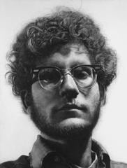
"Frank", Chuck Close, 1969, Acrylic on Canvas
 Untitled, Martin Paar, from "Luxury" series, 2005 (2008 printed)
Retrospect which means, to look back in thought or contemplate the past, is what Kristin and I thought connected these three works together. The Images were located at different galleries with in the MIA. Because they are part of different exhibits they did not automatically relate to one another. However, these images had an impact on us while we viewed them and when we placed the images together as a group a feeling or sense of the past came to our minds. These pieces were all done by different artists at different times. The 2 photographs, Untitled (or cocktail party on the floor, if u will) by Martin Parr and the photograph of the chairs by James Welling, may not say much in terms of narrative, they are quite striking in their composition, use of color and texture. Vivid colors and stylized subject matter reminded Kristin and I of a more glamorous and simple time. Cocktail parties, modern furniture, skirts just above the knee and the use of clean and simple lines, and carefully placed objects invites the viewer into theses photographs and creates this idea of an era gone by. Even the drawing, "Frank" by Chuck Close, has a very retro feel to it. The image itself is quite large in scale and when u see it in person it is overwhelming and incredibly well done. It is so precise that it looks like a photograph. Which for Kristin and I is how it relates to the other works we were drawn to. By placing these images together in an installation we are hoping to create a feeling of the past, but a very modern and important past. I also like for things to be beautiful in their design and composition. All of these works are ascetically pleasing and transport the viewer to another time and place. This idea of beauty over narrative may seem shallow to some, However I consider beauty to be it's own narrative and can sometimes make a greater statement than those works that are meant to shock and awe just for the sake of it. We very much enjoyed the visit to the MIA and will more than likely return to view more works. Observing and analyzing the work that other artists do is an essential part of growing as an artist.
Wednesday, October 27, 2010
Mining the Museum: stuck by myself?
Yeah...guess I was the odd one out, some how, even though I know I had a group. So I'm just doing my own.


I chose the first piece as a representation of the world we tend to build around ourselves. Sometimes we build it in a way where we can look out and others can look in, but we don't pay attention to what could possibly be outside the walls. So in a way, we wall ourselves off and stay in our comfort zones. This can be unintentional, or intentional, but either way it is never good to stay there for long. How else will you be able to learn if you are stuck where nothing new can go?
The second piece represents how we can get wrapped up in our own little worlds that we build around ourselves. It can be a calm, relaxing place, but it can also bring a false sense of security and an unwillingness to step outside the boundaries because it's already comfortable where we are. If you stick to what you know already, then you will never learn anything new and grow beyond what you already are.
The third piece represents the reality sometimes needed to shatter the walls around us. All it takes is one moment to change something entirely, one action to change a perspective, one idea to change a motivation. With the walls shattered, we will be able to interact with that outside of the walls and learn things not known. It allows for growth and expansion and gets us away from that comfortable place. It allows for new sources of inspiration to come in and freedom to move.
Sources +
An exile dreaming of Saint Adorno. Siah Armajani - 2009
Standing Nude. George Stanley [Will get the rest of this info soon.]
Guardian figure. Artist unknown - 1360
+ Meahgan
Karthik Pandian's "Before the Sun"
When I first set foot in this exhibition, I had no idea what was going on. I was greeted by Fillup who harshly appeared out of the darkness and scared me half to death. My eyes had a hard time adjusting to the light, or lack thereof, and I had to stumble and feel my way around the room. Not only that, but there were loud scraping and booming noises that quite frankly creeped me out. I arrived at this place expecting to see sculptures, paintings.. you know, what you typically see in art.....things.
 the piece. On top of the slabs were two film projectors in glass cases.
Each projector played a repeating loop of the sun: the sunrise played in the east corner,
sunset in the west. The 16mm film was fascinatingly supported by a pink twine grid
at the ceiling, creating a unique loop.The audio was of nearby archeologist digging and
searching through the earth, and people were also passing either alone or with children/pets.
After about ten minutes of looking around, stubbing my toes, and having the artwork
explained to me, it finally clicked...
Before the Sun is a contemporary film installation by the artist Karthik Pandian.
Two large slabs (stacked) made of dirt from the Cahokia Mounds in Chicago form the base of
the piece. On top of the slabs were two film projectors in glass cases. Each projector played a repeating loop of the sun: the sunrise played in the east corner,
sunset in the west. The 16mm film was fascinatingly supported by a pink twine grid
at the ceiling, creating a unique loop.The audio was of nearby archeologist digging and
searching through the earth, and people were also passing either alone or with children/pets.
Once I had a chance to understand what was going on in this piece, the fact that I could be a
part of it by walking around inside the art made it feel so thrilling and personal. I had adjusted
and began to feel comfortable, so I sat on the step and watched the sun rise and fall repeatedly
It made you feel like you were there, walking along.. before the sun.
This film instillation was fascinating. It showed me that negative preconceived notions about
a piece of art can make you uninterested and annoyed. You must get to know the piece, get a
feel for it, step in it.
http://www.midwayart.org/exhibitions/10_05_karthik_pandian/
Site Visits
It's funny how you can tell that everyone enjoyed the visit to Anne Cramer's design studio much more. Even if no one wrote anything on the blog, I could tell at the visit. I think that brings up an important aspect being in a community of artists. Anne Cramer's biggest problem has been with growing too rapidly and having too much work to do. I think that's the best problem that anyone can have. Her secret to success isn't just reaching out for help when needed and making lots of friends, for the only way that would have worked is if she had an inviting personality, which she definitely does. I think that everyone, no matter if they were interested in fashion or not, was entranced while listening to her. The way she could talk about the fashion and her life was so relatable and engaging that I think I can say everyone wanted to get to know her better, so it's easy to see how her business grew so fast.
Now, of course, being friendly and enigmatic isn't all there is to having a great career; you have to be good at what you do too. The graphic designers were clearly great at what they do, but from what I heard, it doesn't seem like their business boomed like Anne's has. That's the difference.
There's that phrase that goes, "It's not what you know, but who you know". Now, in the art world, you have to know a little bit of something at least, but at it's core it's a community. That means that making friends and sharing ideas is a great way to get started. That's what I took away from this visit.
Fashion/Graphic Design Site Visit
Something I didn't know before, specifically related to fashion design is how far in advance everything has to be designed and ready in order to be ready for its appropriate season. I thought it was really interesting when Marina asked if it was difficult for her to get inspired about a season she is not even close to being in. I think that's something I would definitely struggle with. With regards to graphic design, I didn't know there were so many steps involved. I began to realize all of the aspects involved such as photographers, models, and even opinions from clients. Going into the fashion design portion, I really did not know much about it. I feel like she did an excellent job not only educating us of all that's involved, but getting us excited about the world of opportunities wrapped up in fashion design. On the other hand, I went into the Graphic design with several preconceived ideas about what it all entailed, and to be honest, I came out less than enthused. I don't think that it was so much that he wasn't educational about it, he just didn't get me excited about it like Anne did. I think it also may have been the types of projects he was working on, I don't know. Overall though, I think it was a great experience of getting out into the local world and being able to see some of what we have been discussing in class in action.
A Lunch at the Belvedere - Kristin Hawkinson
Contemporary Art

http://www.artsmia.org/index.php?section_id=2&exh_id=3377&IM=2&start=1

A Lunch at the Belvedere, 2004
Luc Delahaye
This photograph from the MIA was very interesting to me. It didn't take my breath away when I came across it, nor did it make me want to stare at it for more than 5 minutes. It didn't take me long to "get the picture." The entire "Embarrassment of Riches" exhibit was great.The quality of this photo in particular is what grabbed my attention, and the large scale makes it that much more interesting to look at. I love things that are larger than life. There is also a lot of meaning behind this photograph. Let my explain why..
I believe this picture mocks the famous painting "The Last Supper." It's a more more modern, upscale version of it. This picture, along with the rest of the exhibit, depicts a view into today's economic wealth around the world. What does wealth look like this day and age? Why is it so different from 50 years ago? How have things changed?
Other pictures from the exhibit show those things but in different compositions... such as Alec Soth's Fondation Pierre Bergé and Yves Saint Laurent, Moujik IV, Paris.
Those are the things that makes this picture successful. This new-age modern feel to it. It isn't a mind-blowing sunset or anything. It's a candid picture of something that you have to look at for a few seconds to understand what's going on. It's also appealing to the eye.
Overall, this is a wonderful picture, and an even better exhibit it occupies.
http://www.artsmia.org/index.php?section_id=2&exh_id=3377&IM=2&start=1
Designer Site Visit
When Visiting Anne Cramer's shop/design studio, I was quite impressed. Personally, I'm not very fashion forward, or knowledgeable of the subject matter. Regardless of this fact, I just loved the visit. Anne's energy was almost tangible when talking to us, and one could tell that she was passionate about her job.
Also, I had never considered the amount of time that goes into fashion. When talking about getting ready for Fall 2011, she stated that she should be beginning work within the next two weeks. Time management is a must when working in fashion!
It too, was refreshing to hear that she cannot do everything on her own; it is a collaboration among many. She has a photographer, a PR person, a model, etc. And when she needs help, she asks for input. She really broke the stereotypical fashion designer persona. Overall, a wonderful and insightful visit!
World of Fonts - Angela
American Typewriter


The first font I chose to explore is American Typewriter. I chose to start with this font because the typewriter was one of the earliest styles of typeface. American Typewriter was created in 1974 by Joel Kaden and Tony Stan for the International Typeface Corporation. It was created to mimic the patented Typewriter font in form and monospacing. This begins the way typefaces have been shaped over time and what their uses are. The American Typerwriter is the perfect font for novels because it is easy to read and gives the look and feel of being typed with an actual typewriter. To me, the American Typewriter has a traditional and comfortable look.
http://en.wikipedia.org/wiki/American_Typewriter
Google:Images
Waltography

Over time fonts have changed drastically. For the last several years, companies will patent or create a typeface that will identify their product and become an excellent source of branding. Disney has the perfect example of a signature font. Walt’s signature has become its own font, the Waltograph. Anything could be spelled out in Waltograph and just about anyone on the planet would relate it to Disney. The font has become an icon for the company and helps people to relate the text to the positive image Disney has made for itself. I really enjoy the curve of the lines and the ease of hand in this font. I’ve been impressed with Disney movies and theme parks, so it Google: Images creates an emotional response for me, a childlike feeling of joy.
www.dafont.com
Geneva 
Geneva is a san-serif typeface design specifically for Apple Computer. This TrueType font was created by Susan Kare. With Geneva’s clean lines and generous curve it can easily be compared to the famous typeface Helvetica, although Helvetica is slightly more round and more narrow. Geneva feels almost boring to me, in plain context but I like the roundness of the letters. It would be great for a short, bold, statements because it makes such a solid impact. It also works in a non-bias way for legal documents.
Google: Images
http://en.wikipedia.org/wiki/Geneva_(typeface)
Design Site Visits
One thing that I really liked about the site visit to see the fashion designer, Anne Cramer, was her passion for her work. Her story was awesome about how she first started making clothes when she would play with her Cabbage Patch Dolls. She was welcoming and enthusiastic, to put it simply.
Visiting the Graphic Designer, (name?), was different... However, I really liked the fact that he does non-profit projects. I admire that aspect about his work.
infographic of the day...font poster
 |
| Typography Anatomy Lesson Plan, 2010, Lignature, Loop and Stem |
It's worth taking a look to see a good example of font design...
Also, this is just in from Lynda Monick Isenberg ...

Mr. Hill will discuss experimental typographic work across multiple contexts including sculpture, literature and site-specific installation within the development of graphic communication and the need to develop new critical perspectives to encompass these convergent areas of practice.
Mon. Nov. 8, 2010
Reception 5:30-6 p.m., lecture begins at 6 p.m.
33 McNeal Hall, UMN College of Design
1985 Buford Ave., St. Paul, MN 55108
Tuesday, October 26, 2010
Fonts, movement and bikes!
 |
| Type-Bike Juan Madrigal, 2010 |
Back from our first in a series of site visits to the Anne M. Cramer Studio and Woychick Design and feeling restored and inspired once again by the powers of art and design...special thanks to the designers for their generous sharing of their work, ideas and studios with us! Looking forward to another conversation with both of them and Section D this week...
As we officially begin this dark and blustery midterm week, I want to direct you to another link to that mesmerizing font ballet Ligne I spoke about last week, along with one to designer Andrew Sloat's More Perfect Union, a textual performance of the Constitution. Both of these projects are innovative performances of text and definitely worth checking out.
 |
| Bike Type by George Crick |
Mid term reports are due next week, and I urge anyone who has not yet posted blogs 1-4 (including your collaborative Mining the Museum post due this week,) or turned in their Visual Archive Resource journal to do so now! Section A will have a little work time in the classroom this week after we watch a little of Helvetica, but don't wait til the last moment...
 |
| Write a Bike by Zuri Zaech |
In the meantime, I will leave you with these images of type and bicycles. From the Behance Network comes the Bike Type by George Crick and Write a Bike, by Zuri Zaech, and on Trendland I found the Type Bike by Juan Madrigal, adorned with none other than Helvetica Medium 98 pt. and 198 pt.
And in honor of Halloween and all things type, here's a link to an interesting article by designer and educator Jessica Helfand from her post on Observatory about text and body, with a somewhat spooky image by Chinese artist Zhang Huan from his performance Family Tree.
And in honor of Halloween and all things type, here's a link to an interesting article by designer and educator Jessica Helfand from her post on Observatory about text and body, with a somewhat spooky image by Chinese artist Zhang Huan from his performance Family Tree.
 Family Tree ©2000 Zhang Huan Family Tree ©2000 Zhang Huan |
p.s. This week's art-junk prize of the week goes to the first person to identify the font used in our OAD syllabus.... Happy fonting! |
Sunday, October 24, 2010
Font Investigation-Jeremy Anderson

The first font I chose is called Pappo's Blues. This style looks like it was just scribbled down on paper by someone famous, or a doctor or something. At first I thought it was sort of strange that this particular font made me feel...happy? But it does and I know why. For years I've studied people's signatures because I think the practiced lines that people can make when writing their name are some of the finest lines on paper in the entire world. Nobody practices lines as consistently as their name because while your style or favorite medium might change, your name never (rarely) does. I think a font like this would be best used as a signature example in a novel, or a band poster or something of the like.
 This next font looks playful yet planned. 2 Peas Goofball makes me think of the writing in a comic strip or the Sunday Funnies. The way the letters are offset but also clearly legible gives them a strange sense of order inside the chaos.
Seeing as I have been a fan of the Sunday Comics for as long as I could see pictures, this naturally makes me feel very comfortable. It reminds me of being young and waking up Sunday mornings to read the comics with my dad. I think this would be used best in a comic strip, or a party invitation? It's an OK font, but I think it has little future in the corporate world, or anything serious.
 From the moment I saw I needed three fonts I knew that my third and final style would have to be good enough that nobody would ever forget it. Instead I picked 7Days to finish everything up. This style is an ultimate, final font. By saying this I mean that it looks like it should be the count-down font before the world blows up in a movie (or real life), or maybe a global disaster movie. This is a serious, dramatic font which makes me feel like whatever is being described is quite an important situation. Even the name is called 7Days...which to me implies that if you use this font it will exist for a exactly week and then will ignite everything it's printed on into a single, pure oxyhydrogen flame. This will then burn for 7MoreDays and will then abruptly dissipate leaving nothing except a light wisp of clean white smoke.
Pappo's Blues, 2 Peas Goofball, 7Days found at: http://woork.blogspot.com/2009/02/10-beautiful-and-free-fonts-for-web.html
Karthik Pandian: Before the Sun
When I first walked in, I was a little confused. there was a large platform in the middle of the room and two videos shown in opposite corners that honestly looked like a home video from a family vacation. Initially, I was like what the heck is this, but it's not until you learn the background that you can start to fully appreciate the piece. The films in the corners captured people walking among St. Louis' Cahokia Mounds. Every other element of the installation works towards the idea of remembering the past through the videos. The large platform is made from dirt taken from the area. The two videos are not even in fact two videos. It is actually only one video that is being strung between two projectors. The projectors are actually imbedded in the platform and sort of protrude as two columns of mirrors. The sunrise and sunset shown in the videos was from the same archaeological site. the film was fed through one projector and up above on some strings similar to those used in archaeological digs. all these were symbols of the location where the video was filmed. Metro magazine writes, "The symbol laden display is intended to remind the modern viewer both of his connection to the ancient people and of the relationship we all have with the sun" (metromag.com). As stated in Metro Magazine, this piece is almost entirely made up of symbolism. Everything from the large platform to the almost invisible strings overhead carries some sort of symbolism for the location and the people, both past and present, who inhabit it. City Pages writes, "in this film installation by Karthik Pandian, the artist explores our connection to the past through filming ancient clay mounds made by people from Cahokia long ago" (blogs.citypages.com). Pandian's main goal, I believe, was to show the history of the area and its people through the use of symbolism and imagery.
Saturday, October 23, 2010
Mining the Museum Tess and Quinn


Fred Wilson took different pieces from the museum and arranged them to create and new work of art. We have taken three objects that we feel show some sort of inner darkness or struggle. Our first is called Woman's Wrapper by Kouadio N'Gri Bernard. This would open the instillation the pattern draws the you into an infinite darkness. The next is called Maja by Antonio Saura the variation in line weight adds to the darkness of the piece that we feel is emotional and intriguing. This would be on the next wall of the gallery. This would represent the total chaos of life. Our last is called Coffin Bank by Yone. This would be at the end of the gallery it would represent the box that humans put their emotions in. Our installation is meant to show emotion, fear and the sense of being trapped.
All images were taken from http://www.artsmia.org/
Mining the Museum: Peace, War and Communism (Fillup & Kaycee)
 |
| Enshrined Buddha, c.1800, Burma, wood,lacquer, gold leaf, mirrors and colored glass, MIA |
 |
| Wheel Lock rifle, c. 1630, German (Central or Southern), Iron, fruitwood,bone, mother-of-pearl, and cowhorn, MIA |
 |
| Great Criticism: Disney, 2000, Wang Guangyi, Chinese, Oil on canvas, MIA |
Images Courtesy of the Fred Wilson installation at the MIA "Mining the Museum"
Thursday, October 21, 2010
Mining the Museum: Places of Rest - Angela, Sarah, Maisey
Inspired by Fred Wilson

 Price of Cheng Ching’s Sarcophagus, the Cartonnage of Lady Tashat, Wenzel Friendrich’s Platform rocking chair, and Roy de Scheemaker’s Pallon chair (along with other forms of burial, chairs, benches, stools and beds) come together in the Places of Rest instillation. With these pieces we have created a morbidly, humorous piece. We have taken different artistic forms of burial from around the world, different time periods and cultures for this exhibit. Viewers will walk under a metal welded arch stating the title of the instillation, “Places of Rest,” into a room filled with different examples of final resting places. The ironic humor will set in when the viewer notices the chairs and benches scattered about the room indicating a temporary resting place.

Sarcophagus of Price of Cheng Ching (Yuan Mi)/Limestone/China, Northern Wei dynasty/Minnesota Institute of Art
Cartonnage of Lady Tashat/painted and varnished linen; polychromed pine coffin/Egypt/1085-710 B.C.E./Minnesota Institute of Art
Platform Rocking Chair/Wenzel Friendrich/Horn, ivory, and glass with ocelot upholstery/1880-90/Minnesota Institute of Art
Pallone Chair/Roy de Scheemaker/Leather, chrome, plastic/1989/Minnesota Institute of Art
Subscribe to:
Posts (Atom)