Friday, December 31, 2010
New Year's Toast...
'Last Leaf' Video courtesy OK Go and EMI
Hello everyone..
Just finishing up your final grades and wrapping up the semester.
Congratulations on your wonderful Merit Award presentations. It was a pleasure to take part in the fun...
Your journals and lab books will be available to you next Tuesday in the Western Faculty office, and your remaining grade sheets tucked into your Summit mailboxes.
Congrats to all presentation and video-post winners... your prizes await you...
Cheers and have a safe and Happy New Year!
Sunday, December 19, 2010
Soth like Both

Alec Soth has taken over the photo world in the cities and I’m frankly sick of it. Every museum or gallery I have been to since I’ve moved here has had some of his work in it and it’s starting to become cliché. When I first saw Soth at the Weinstein gallery, I already knew that he was a hit and I didn’t know why. Comparing him to Mapplethorpe, I thought he wasn’t anything special. In fact, I didn’t see much of anything in his work. I was wrong. When visiting the Walker Art Center I heard that Soth had an exhibit showing. I decided that I should peruse it and see if I could finally figure out what the hype was all about. Alec Soth isn’t just a photographer. He’s a narrator and a story teller, if those two things aren’t already the same.
The difference between this exhibit and the others I had seen with Soth in them, is that Soth’s work was displayed by itself and much fuller. I saw a lot more of his work and was able to make some sense of them instead of comparing him to the other photographers around him. His exhibit is multi-roomed that contains all wall spaces filled with photos, some sculptural objects related to his work and even a video recording explaining some of his works. All of his photos were large, chromogenic prints, and sometimes he interlaced them with hand-written notes that help create captions and stories for his art.
There isn’t just one photo that I appreciated or found something that I enjoyed. To start, Soth has so many photos that span across the Midwest and any other parts of our country and Canada that you can’t help but to find something to recognize. When looking at a couple of girls from Davenport Iowa, in a picture called Mother and Daughter, I tried and felt like I had some connection. I knew nothing about these two girls, but since I’m from Iowa and I know their type, or at least I think I know their type, I have a connection. Since Soth is taking pictures of ordinary people in familiar places, we have a connection to the people. Seeing them in a museum setting brings a feeling of importance to the viewer since they know the person, or at least their origin.
Not only can I get a strong connection to Soth’s photos but allow for so much imagination with his photography. The majority of his photos have one small caption or just the title that give just enough information to form your own ideas about it. In one particular photograph he leaves it devoid of any title or caption. This is a picture of a lumberjack looking man with red hair sleeping on a log in the forest. There is so much to be interpreted here. In an article I later read about this exhibit, Soth states that he wants some of his photos to be interpreted. Apparently this man he met in a monastery, although he wasn’t a monk. He wants the viewer though to come up with their idea of who this man is. Soth states he looks like a leprechaun, but I think he looks like a fairytale lumber jack, like Paul Bunyan or somebody. As art states too, I can’t be wrong.
One of the photos I remember from the Weinstein was a picture of a balding, middle-aged man sitting in a living room in front of a fire holding a birthday cake. Sitting next to him on the ground is a woman, barely dressed in a swimsuit, very obviously a stripper. When I visited the Walker, my thirst for the story there was finally quenched. When visiting Missouri, Soth attempted to find the loneliest man. He found many interesting subjects, but this guy topped them all. Spending 5 days a week at a strip club, Soth took him out to eat. He finds out that his birthday is the next day and none of his family or friends are alive to celebrate it. Soth buys this stripper and you see the results in the Walker Art Center. What a crazy story! This kind of realistic story-telling feeds into people’s need for imagination.
The greatest achievement that Soth has under his belt is the personality of the people he takes portraits of. Soth’s portraits very obviously tell something about who the person is. Their pose is not contrived; it’s something that exists in their real lives. How does Soth capture this though? A photographer must get to know the people or person before he can take a picture that captures so much personality. It’s beautiful and powerful, but I wonder how he does it? How does he establish that strange relationship between stranger photographer and ordinary person? How long does it take for that relationship to flourish enough to produce the picture? In the instance of the Mother and Daughter in St. Paul, their picture was taken in the parking lot of a K-Mart. Not much time must have been given, and yet this picture is very believable.
Soth’s photos have so much going on. I feel almost foolish for dismissing it so quickly. The imagination, the true portrait, and the raw story create some of the best photography I have seen in a long time. This is the kind of picture that I can relate to and the kind that I want to take for myself. The question is, how do I go about it?
Friday, December 17, 2010
Thursday, December 16, 2010
The Festering Wound of Typography


This may be a tad cliche to whine and scream and bitch about Comic Sans, but I think I have an interesting approach to doing so...
Comic Sans is the root of all evil in the universe. The font was designed to replicate the look and feel of the text represented in Comic Books, while boiling down the stylistic elements of comic text for practical and universal application.
That doesn't sound so bad. It's kind of cheeky. It's nice. It's cute.
The reason this particular font is the modern crucifixion of all things good and right in our civilization of visual communication is this: Comic Sans, while attempting to replicate the look and feel of a medium that relies on several other elements to properly communicate for use beyond that initial medium, cheapens its source material and prolongs (and even contributes to) the downfall of the hand-written script.
Let's talk about the content of this statement, and not talk about how lengthy it is. I say it has this effect on the modern hand-written script because it, by nature as a typeface, is broken intentionally. "Comic Book script" is the way it is to FIT ITS INTENDED APPLICATION... I am sure that when typing a memo, the people that write in comics do not want a memo to look like a comic. Another thing is, in the process of boiling the stylized elements of the average comic book script down to this socialistic watered-down filth, there are vital flaws in how the characters of our English alphabet was structured to be. For instance, Comic Sans' kerning is broken within the default of the typeface itself. Kerning is the distance between characters. The letters "e" "d" and "s" have substantially uneven spacing within themselves, and in relation to each other. Along with that, several of the characters themselves represent as an almost textbook definition of what NOT TO DO when writing letters. The shortened upper curves of the "c" "e" "C" "O" "o" "p" characters (and others of that nature) are 1: inconsistent in relation to each other, and 2: the overall structure of all the characters embody the typical bad habits of handwriting.
The difference is that Comic Sans is permanent. It isn't like handwriting where it can get better with time and practice. No matter how much you want to (WHICH I KNOW YOU DO), you cannot sit and type sentences in Comic Sans over and over again in the aim of having it get any better.
It wont happen. Ever.
The font I like is Friz Quadrata. It's awesome, and either commonly mis-used (in the 80's) or not used at all. The sharp forms of the characters and mix of elegant curvilinear strokes with very sharp and subtle angular peaks and serifs make it almost look dangerous.
Honestly, there is a lot to say about Friz, but I am so overwhelmed with hate for the previously visited "unmentionable" that I feel I may take it out on Friz... and I don't want to ruin our friendship... She's always there for me when I need her.
(how weird is he? he's talking about a font like it's a woman. And now he's talking about himself in the second person. I have a feeling that sleep wont help him at this point.)
DISCLAIMER: THE IMAGES OF ONE OF THE FONTS HAVE BEEN KNOWN TO CAUSE SERIOUS EYE DAMAGE, SEIZURES, INCREASED BLOOD PRESSURE, NAUSEA, PROFUSE VOMITING OF BLOOD, AND DEATH. IF YOU HAVE ANY EXISTING HEART CONDITIONS, NEUROLOGICAL CONDITIONS, CURRENTLY MEDICATED FOR DEPRESSION OR ANXIETY, OR PREGNANT, PLEASE CONSULT YOUR PHYSICIAN BEFORE VIEWING "Comic Sans".
[ . To like or not to like... . ]

...that is the question.
I've been to the Walker Art Center several times in the last few years and I've seen exhibits come and go as they please. It's pretty much the same for most museums, if not all. I have a hard time enjoying modern art and photography, however. Especially contemporary modern art. I've loved traditional renaissance work my entire life and that's more where I'm drawn to. So it's no no surprise that there's few things I like in the Walker Art Center. There's several things I hate, in fact, or I just find them so monotonous I pass by without casting a second glance. The latter was my initial reaction to Alec Soth's Misty, at first. I was looking through his entire exhibit and very few pictures actually caught my attention. Each time I passed that particular image, however, I was more drawn to it. It's so simple in presentation and composition, yet the more I looked at it, the more I just simply liked it. It's a beautiful piece, and the female subject's expression only adds to it. It presents a sort of grey feeling, over all, and the feeling is beautifully captured in her face. I really do like this image now. It defines beauty in a different way, which intrigues me. Simple statements can hold as much power as the complex.
[ . Fonts. . ]
Fonts are such an everyday thing that most people don't ever really stop to think about them. They are everywhere, used to usher forth text in various styles and present ideas or portray feelings. A simple font can hold a lot, as it can provide a very powerful message, or provide something so subtle you hardly notice.
 The first font I would like to present is Tahoma, and the fonts of the Tahoma font family. It is an OpenType font, created along with the font of Verdana to be a default font for Microsoft's Windows 95 in 1994. It was designed by Matthew Carter, a well-known typeface creator and designer. It is a very basic font, and is considered to be a humanist sans-serif typeface. To me, it has a smoother appearance, and I prefer it to a lot of the OpenType fonts available. I used it as a default for many things, as it can be very presentable in many different media. The understated flow of each letter, and the slim spacing, makes for a stable font that can either be played up or used for its simplicity.
 Digitalix is the next font I'd like to bring to light. This font, and the others that are similar to it, hold a form of nostalgia for me. They remind me of the glorious 8-bit video games and things like Dungeons and Dragons, which appeals to my nerdy/geeky nature. It also reminds me of technology, in general. It's such a digital font that it's hard -not- to think of technology. This also appeals to me because I work with computers as a hobby/side living. The creator of this, I'm sure, is someone who just wanted to create it for personal use. There is no real history for this font, as is the same for many modern fonts out on the internet. Still, it's one of my favorites and will continue to be.
 The third and final font I would like to discuss is First Order. It is another decorative font, one that is caught somewhere between Arabic and Celtic origins in appearance. The dots blended in with the letters bring to mind an Arabic font, yet the actual designs of the letters lead to a Celtic design. This can be used as nothing more than a decorative font, but it is very interesting, nonetheless. It brings with it a statement of age and intrigue and I would most like use it in one of my advertisement designs or posters. I have used similar fonts previously for prior works. The origins of this font are similar to the previous font, as this was simply created for an idea by a single individual.
http://www.microsoft.com/typography/fonts/family.aspx?FID=19
http://www.dafont.com/digitalix.font
http://www.1001freefonts.com/FirstOrder.php
 The first font I would like to present is Tahoma, and the fonts of the Tahoma font family. It is an OpenType font, created along with the font of Verdana to be a default font for Microsoft's Windows 95 in 1994. It was designed by Matthew Carter, a well-known typeface creator and designer. It is a very basic font, and is considered to be a humanist sans-serif typeface. To me, it has a smoother appearance, and I prefer it to a lot of the OpenType fonts available. I used it as a default for many things, as it can be very presentable in many different media. The understated flow of each letter, and the slim spacing, makes for a stable font that can either be played up or used for its simplicity.
 Digitalix is the next font I'd like to bring to light. This font, and the others that are similar to it, hold a form of nostalgia for me. They remind me of the glorious 8-bit video games and things like Dungeons and Dragons, which appeals to my nerdy/geeky nature. It also reminds me of technology, in general. It's such a digital font that it's hard -not- to think of technology. This also appeals to me because I work with computers as a hobby/side living. The creator of this, I'm sure, is someone who just wanted to create it for personal use. There is no real history for this font, as is the same for many modern fonts out on the internet. Still, it's one of my favorites and will continue to be.
 The third and final font I would like to discuss is First Order. It is another decorative font, one that is caught somewhere between Arabic and Celtic origins in appearance. The dots blended in with the letters bring to mind an Arabic font, yet the actual designs of the letters lead to a Celtic design. This can be used as nothing more than a decorative font, but it is very interesting, nonetheless. It brings with it a statement of age and intrigue and I would most like use it in one of my advertisement designs or posters. I have used similar fonts previously for prior works. The origins of this font are similar to the previous font, as this was simply created for an idea by a single individual.
 http://www.microsoft.com/typography/fonts/family.aspx?FID=19
http://www.dafont.com/digitalix.font
http://www.1001freefonts.com/FirstOrder.php
Taking the Damn Pills
There's a wonderful film (and even more wonderful book) called One Flew Over the Cuckoo's Nest... Jack Nicholson plays a newly admitted patient at a mental institution in the 1960's.
He's insubordinate, witty, and very much an individual...
The head nurse and his character get into a bit of an ongoing quarrel because he doesn't want to take his medicine.
With a bunch of bad noise and some Oscar winning drama, he ends up getting lobotomized.
Despite all the other messages the film has to communicate, the one that I'm relating to is the idea that if you don't take the pill prescribed, there will be consequences...
That "blogathon" begins now, and hopefully a couple spoon fulls of sugar will help this medicine go down.
h.
Wednesday, December 15, 2010
[ . Sustainable design. . ]
It's really amazing at how much the human race is trying to get back to the roots of nature and incorporate it into modern design and technology. It's been evident for some time with small things popping up every now and then, such a velcro, invented in 1941, and self-healing plastic in 2001, but very recently there's been a surge in biomimicry and sustainable design. Architecture is one of the most dominant areas that this is affected with. There are several buildings, both large and small, that have begun to incorporate sustainable design as a means to improve efficiency and leave a smaller footprint on the world around them. One such building would be the Phare Tower, due to be completed by the Morphosis Design firm in 2012 near Paris, France, pictured below. The entire building has nothing but smooth lines and a very unusual design, altogether. It is 68 stories of double-skinned, clear-glazed facade to not only improve efficiency, but also provide more natural light to cut down on energy costs. Beneath, the building possesses a wind generator farm, which then goes to provide what energy is needed for the building, instead of drawing on the local power grid. All in all, it is an unusual design, but it makes sense. The more efficiency achieved with modern architecture means we need to draw less and less on power grids and artificially generated energy. That can only mean for the better for this planet, itself.

http://www.fengshuichat.com/sitearm/sustainable_design_images.htm

http://www.fengshuichat.com/sitearm/sustainable_design_images.htm


Check this out! Angela.
Colored light in three dimensions, think about it.
http://www.youtube.com/watch?v=QWekIcZaKns
There's the link... because the video wouldn't work.
http://www.youtube.com/watch?v=QWekIcZaKns
There's the link... because the video wouldn't work.
and the (Turner Prize) winner is...
Susan Philipsz is winner of this year's Turner Prize, an annual award normally held at the Tate Museum in London to celebrate new developments in contemporary art.
This year's winner, the 4th woman to receive the award, and an artist whose work centers around recordings of her voice singing folk songs over public address systems, caused yet another art world stir...
Here's a link to UK Telegraph article on the 2010 Turner Prize contestants....
Susan Philipsz Lowlands http://www.youtube.com/watch?v=UWeKzTDi-OA
Pros and cons- the art world (and elsewhere) weigh in...
An article from the BBC
Article on Lowlands from Nouse.com, the UNY
You be the judge.
Your turn tomorrow...
End of the world (class) as we know it...
REM End of the World video Courtesy EMI
(apologies for the ad..)
OK everyone- here we go on the final stretch...
Post all of your blog assignments...
Bring your Process Journals and Lab Books to class tomorrow to turn in for grading...
Come prepared with a 1 page Artistic Merit Award paper (typewritten with 3 cited sources...)
Bring a treat to share...
We will watch presentations, vote for the most worthy, and celebrate a semester of good work and interesting conversations about art....
Oh, and don't forget to post your favorite art/music videos to the blog for our distinguished panel of judges...(appropriate for general viewing, please!)
And speaking of art censorship... here is a link to a NY Times article about the latest arts/censhorship controversy: the removal of an excerpt from the artist David Wojnarowicz’s video “A Fire in My Belly” from an exhibition at the National Portrait Gallery at the Smithsonian. (remember our 'Difficult (challenging) Art' discussion?)
Food for thought...agree, disagree, indifferent?
Stay warm and see you all tomorrow!
Tuesday, December 14, 2010
Notice: I am breaking the rules! Love, Meg
I know we were supposed to post just one video, but I came across this today and remembered how great it is...and possibly delirious with sleep deprivation, I thought I absolutely had to share it with you all. Enjoy!
I Cut Like a Buffalo by The Dead Weather.
Monday, December 13, 2010
Sunday, December 12, 2010
Sorry Art World: Blog 7

When we went to the Walker some weeks ago, we saw the stage for “Naked” by Eiko and Koma. The stage, consisting of a nest of damp straw, feathers, and folded canvas, is surrounded by burned canvas covered in sweet rice paste, bird feathers, and large particles of sea salt. A generated breeze blows through the space and water drips periodically into the soil. Bird sounds accompany amplified sounds of the dancer’s bodies as they slowly move around together on the stage. Six hours a day, six days a week, Eiko and Koma are there moving around, performing their piece.
At first, I was totally shocked that two people rolling in piles of straw and soil could be called art. This shock made me want to learn more so I could make a more informed statement about it, for I never want to come off as arrogant.
I went back to the Walker and witnessed the performance for myself, then read through the Walker’s pamphlet on the piece, for I did not get the chance to talk to either of the artists in person. If I had to guess the point of the piece without any outside information, I would honestly be guessing in the dark. The piece, in their words, is placed in the museum in order to allow the viewer to focus on their bodies’ relation to time, space, and the environment. They say the body offers a radical questioning, not in asking questions, but in questioning as a state of being. The idea of them telling a story of some sort, as present in a lot of art, is gone. They wanted to take away the story and only leave time and presence.
This piece needs to be seen in order for you to gain a full grasp of it, so I’m glad I went. But, sadly to say, I was not moved. Maybe my preconceived notions of this piece got in the way, even though I tried to not let them, but I just find it hard to meditate on two naked people moving around in feathers. I’m not trying to cheapen the experience, for some have told me how they became engulfed in the performance, that it was even somewhat like meditating, but for me it was not. What am I supposed to gain by contemplating these movements, sounds, and surroundings in contrast with what I know? I’m not sure. Not to be offensive, but you can role in a bed of feathers and call it art and say it has deep meaning, but I for one am not going to buy into it. Sorry art world.
-Tyler Lauer
Saturday, December 11, 2010
From Meg, With Love: My Favorite Video, a Stop Motion Masterpiece
Dearest OAD Bloggers:
Here is a treat for you to enjoy during your last week of school for the semester! This is my second favorite music video (the first one being The Beatles' Hello Goodbye, it will cheer even the saddest hobo on the coldest winter night), and also one of my favorite bands and also one of my favorite songs.
love,
Meg
Friday, December 10, 2010
Thursday, December 9, 2010
Cherry by Ratatat
This video is breathtaking at 2:40, when the beat drops. Otherwise the song is simply beautiful and relaxing.
Blog #7 - Tess B

La Fortune (after Man Ray: 3) by Sherrie Levine made in 1990 was a particularly difficult piece for me. Initially when I looked at the piece I thought ok it’s a pool table with only three balls. But I felt very foolish when someone pointed out that there were no pockets for the balls to got into, so it couldn't be a pool table not to mention that it is much larger than a normal sized pool table. This piece is set up in the middle of the room at an angle with nothing around it. On the table there are two off white balls and one red ball all spread out around the table. This piece was made in response to La Fortune by Man Ray, which was made in 1938. La Fortune depicts a large pool table with two off white balls and one red one is extending into the sky where there are different colored clouds and mountains along the horizon.
In many of Sherrie Levine works she takes elements from other pieces of art and incorporates them into her own work. She particularly focuses on works by men that associate themselves with modernism and avant-garde in the 20th century. The concept used by Levine is one that can be interpreted as an expressiveness, feminist strategy, or originality and creativity.
When I heard form out tour guide at WAC that this piece was made in response to a mans work and made the main focal point to that work into her own, I initially felt like that was wrong. I realize that she took the piece out of context and made it her own, but that still fells a lot like steeling to me. I was also told that she made this piece during the feminist movement showing that women have power and can do it just as well as men can. I am all about feminism however I don't think that this should be your entire reason for taking a man's piece of art and making it your own.
Image form
http://www.artsconnected.org/collection/108219/surrealism?print=true#%281%29
http://www.davidrumsey.com/amica/amico682299-125163.html
http://www.artsconnected.org/resource/110616/sherrie-levine-la-fortune-after-man-ray-3-1990
Biomimicry - Kristin
My first example is the Solar Lily Pads in Glasgow, UK:

Along the Clyde River in the city of Glasgow, there are solar panels in the shape of lily pads. This makes for a creative, interesting design and
a beautiful scene in the river.

Using the design of a lily pad to maximize the
collection of the sun's rays, these solar panels send electricity throughout the city. Most urban
design schemes generate more renewable electricity and usually focus on rooftop photovoltaics or wind turbines; it takes a creative leap to come up with Solar Lily Pads. It's perfectly natural and not at all harmful to the river. It is hopeful that more governments will use this technique in the future!
The next example of a sustainable design is located again in the United Kingdom. It is called the "Eden Project."
 It is a 124-acre conservatory in Cornwall, UK. This series of domes hosts spectacular events such as
beneficial rock
concerts. It also has an eco-friendly
gift shop (full of "tree-hugger" treasures). Think of this as a bot
anic museum- it is meant to attract people to go inside and learn about sustainability. Everything
about it is made from natural materials; even the dome itself is made from plant-based matter. It is also very energy efficient, and the energy used to run the facility is purchased from regional wind farms... and

the car fleet is almost entirely run on cleaner-burning propane. This architecture is not only meant to be an amazing attraction, it is meant to put in our minds the thought of being green. It is meant to inspire us to action.
The last example is a cactus building in Doha, Qatar: The Minister of Municipal Affairs & Agriculture building.
 This is a wonderful examp
le of biomimicry: the skin of one of the hardiest pants of the desert is applied to the design of the facade of a desert building. It has hundreds of smart shades that open and close depending on the strength of the sun. It also features an ancillary botanic dome on the side (like the "Eden Project") which furthers it's green rating. Not only is it cool to look at, but it's also eco-friendly! If we can use some of these designs, and even come up with our own, we can make this world a better place. It's understandable t
hat it's hard for everyone to "go green," but these simple buildings and structures are what we could be using to do that.

Wednesday, December 8, 2010
Biomimicry - Tess B

The worlds emissions and wast will be cut down dramatically if there was no need to dye anything any more. The chemicals used to make the dyes wouldn’t be needed, the water, and the energy to heat the water. Teijin Fibers Limited of Japan is doing just that. They are making fabrics where the colors are created by using varying thicknesses and structures. This basic idea comes form the Morpho butterfly and its vibrant colors that never fade.
http://www.asknature.org/product/4c0e62f66bcccabf55a1f189da30acb3
The world and ev
 eryone in it wouldn’t have to deal with nearly as many harsh chemicals at we do now if we were to use the idea given to us by the beautiful Lotus flower. The leaves of the Lotus have epicuticular wax crystals sticking out form the surface of the leaves giving it a roughened surface. This rough surface makes it harder for water and dirt to stick to the leaves surface because it causes there to be less contact between the water and the leave. With less surface for the water to bind to the polarity of the water causes it to form a sphere which will then role off the surface of the leaves. This idea is being applied to paints, glass, and even textiles which will nearly eliminate the need for harsh chemical cleaners.
http://www.asknature.org/strategy/714e970954253ace485abf1cee376ad8

With the overall CO2 emissions being as high as they are, and the rain forests disappearing its a wonder isn’t wonder that someone hasn’t thought of this sooner. Marco Castro Cosio of NYU came up with the idea of putting gardens on the top of the city busses in New York because it is so hard to find open useable space anymore. According to www.gizmag.com and Cosio’s research if gardens were planted atop all of the busses there would be an estimated 35 acres of gardens driving around New York City every day. By doing this the plants would not only look nicer, this
would improve that air quality as well.
http://www.gizmag.com/bus-roots-biobus/16591/

Walker Piece. Slerum
Jene Highstein
Untitled, 1987-1988
Sculpture at the Walker.

This piece is confusing and difficult to me. I personally don't find it interesting, what is the meaning? Why did the artist create it? This piece makes me wonder who, what, when, why, and how? I want to know why the artist used the material he did. I see three rounded rocks and to me thats no different than what you would see in nature. I know the artist made a mold from metal and formed cement around the metal to create them, but they are still not interesting. This brings up the question of what is and is not art? I think this is art, I just don't find it interesting. Would this be more interesting if it was made with a different material?
-Sarah Lerum
(www.walkerart.org)
Anne Cramer- Tess B
According to Anne Cramer, the twin cities fashion designer who’s studio we went to visit earlier this year, you can ether budget the time you are given and attempt to stick to that schedule, or you can just wait until inspiration hits you. Now as much as my mother and all my former teachers may disagree with this, I full heartedly agree. Procrastination is very much how I myself work, without the pressure of time looming over me I find it close to impossible to come up with good ideas for assignments, projects, and jobs. Over the many years of hearing about how procrastination is bad and how you shouldn’t do it, I found it so refreshing to hear a professional say that they do. Although the idea of procrastination being a good thing was the biggest part that I took from my experience visiting the studio of Anne Cramer she also spoke about her struggle and everything that she had to go through to get to that point that she is at today. Overall my experience with Anne Cramer was a wonderful one, her bubbly personality and great sense of humor are positively infectious. I enjoyed myself very much and would encourage everyone to make a trip out to her studio.
Fonts- Tess B

Trajan
Normally you would think that a place like Victoria’s Secret that is known for its beauty and sex appeal would create a logo that does just that, and they do. However most people probably wouldn’t think to use the typeface form movie posters such as I am Legend, Memoirs of a Geisha, Titanic, or Nightmare on Elm Street. The typeface Trajan created by Carol Twombly is a very widely used font and can portray many different messages, anything form triumph to terror, sexiness to suffering and because of its many uses Trajan is sometime referred to as the movie font. When I look at the typeface Trajan and I imagine a seen around it, I feel like i should be back in ancient Rome in the time of Achilles and Helen of Troy. I distinctly remember once seeing a poem carved into stone and the font used was Trajan, and I remember feeling like that piece had withstood the ages.http://www.underconsideration.com/brandnew/archives/sexy_serifs.php
http://mokokoma.co.za/the-faces-behind-20-famous-typefaces/
 Gill Sans
The typeface Gill Sans has a nice look to it, clean, modern and still a little fun. It is a sans-serif typeface that will get the job done. This is a wonderful and playful font that portrays a sort of innocence and I think that is why when I see it I am reminded of a child's birthday invitation.
http://www.markboulton.co.uk/journal/comments/typeface-of-the-month-gill-sans
Myriad Pro
If someone were to
 ask a child if they knew what Myraid Pro was they would most likely have no idea what it is. However if you were to ask them if they knew what an iPod is chances are they would pull one out of their pocket or something similar to it. Day after day we see and use these technological devices and rarely look at the little details like the typeface. The innovative and cutting edge font that is Myraid Pro has no variations and is as clean, and cutting edge as the devices that it advertises. When looking at this typeface I can’t help myself but to think that it is reliable and it means business.
http://commons.wikimedia.org/wiki/File:IPod_Myriad_Pro_Semibold.png
Blog 6

Light and wind are combined to make The Exhale art installation at Art Basel Miami. The pavilion, from Phu Hoang Offices and Rachely Rotem Studio uses 25,000sq.ft. of space and 7 miles of reflective ropes. The canopy responds to light, wind and human movement. Senors respond to the lightest touch of wind or a person, basically anything will turn these lights on. The
 result a glowing canopy of light and color.
Artiest Andrew Smith uses pieces found in junk yards to make sculptors that are fun and lively, they also pump water, move small objects and make noises. Smith uses whatever he finds to make his art. The results are fun moving pieces of ar
 t.
t.Old drain pipes have been given new life. Using light and color the pipes are the center of an installation in Surat, India. Urfun-Lab, the spontaneous volunteer-built the piece hoping to give life to a small community in India. The pipes can be touched, climbed on and looked at. http://www.greenmuze.com/art.html
and just for funzies, a WTF moment by film artist Ryan Trecartin
http://www.ubu.com/film/trecartin_kitchengirl.html
Click that link.
Video by Ryan Trecartin, courtesy of Ubuweb.
love,
Meg
Blog Number Seven: by Meg

The difficult work I chose to analyze is postmodernist Yves Klein's "Obsession de la levitation (Le Saut dans le vide)." Created in 1960, this black and white photograph depicts a man falling intentionally out of a window on the second floor of a house-like building along a fragmented paved road. While this piece didn't shock me, or make me uncomfortable like the 3D installation piece with the feathery bird people and the little video in the wall of the mouth filled with rocks. No one, besides myself, seemed particularly struck by the relatively small black and white photograph displayed in the corner of the room, and neither was I at first. What caught my attention was the title, being in french it literally translates to “Obsession With Levitation (Leap into the Void).” After reading the title, the picture seemed much more emotive, as if the man leaping from the window was actually going to levitate a millisecond after the photograph was taken. Before reading the title, I thought it seemed odd that he was attempting to commit suicide at such a low height, but I now realize that there is a very different type of desperate facial expression shown. The jumper’s face says suspense, of course, but it also says desperation and hope, as if Peter Pan had sprinkled him with a bit of pixie dust and he so badly wanted to believe that he could fly. I look at this photograph and I see a narrative of a man’s whole life, leading up to this very fraction of a second that Klein has captured. I imagine a whole lifetime of dreams of levitation, years of experimentation and mockery all leading up to the moment where the man becomes perfectly horizontal in the air. Will he stay, will he simply fall to the ground and be badly injured in mind and body.
The photograph appears to be taken in one-point perspective, which I think is very important to the composition. While it doesn’t quite lead the the viewer’s eye in the direction of the man, it allows the fence and the train in the background to lie exactly horizontal. This helps build the suspense while the viewer imagines the last few milliseconds before he too becomes horizontal. At the same time, the lines created by the perspective create a sort of tension. Since the viewer’s eye isn’t lead directly to the obvious subject matter, it leaves us waiting and wondering about the fencepost and gate that the lines seem to point toward causing us to take a closer look. There are two men pictured here, and one of them is quite obviously the subject matter, but I think the other is as important to the composition as the jumper is to the subject. The biker really lends a sense of dynamic balance to the picture since, as humans, we look first for other humans in a situation. The fact that they are both moving quickly in different directions gives the photograph a sense of spontaneity, having caught the picture before the composition collapses. I think the artist was really trying to convey a sense of ironically hopeful desperation. The grayscale effect works well to create an intentional weight to the picture, while the crumbling pavement and dirty brick buildings give it a really thick visual texture. These things in conjunction with the biker riding obliviously away in the background and the direction of the perspective lines creates a very intentional distraction from the focal point. It is as if Klein hoped to create this every day situation in which one man is having a very extraordinary moment.
biomimicry. slerum
The study of animals to improve man-made structures is very common. In sept, 2010 "Todd Reichert, a PhD student at the U of T Institute for Aerospace Studies, announced he had completed the first continuous flight of a human-powered aircraft with birdlike flapping wings, a device known as an ornithopter." (Allen, Black)
Todd said that he wanted to create a craft that could fly like a bird and resemble bird-like wings. Todd took 65 test runs before the actual success of the flight.

Todd said that he wanted to create a craft that could fly like a bird and resemble bird-like wings. Todd took 65 test runs before the actual success of the flight.

Many artists and designers are looking at animals and noting how they eat, fly, run, and other aspects to build things that resemble the way animals do things. Other things that are looked at are birds wings and beaks. These features have been studied to help airplanes.
Also, some animal skins have been looked at so designers can mimic a similar design for other materials.
http://www.thestar.com/news/canada/article/864633--u-of-t-student-makes-history-with-human-powered-flapping-wing-plane
Font. Slerum


-slerum
(www.vletter.com)
HERE WE GO AGAIN
OK Go - Here It Goes Again from OK Go on Vimeo.
Moving into the final two weeks....
Here's the inspirational video I've chosen for you as we move into the final countdown...
By now most of you've emailed me with your choice of Merit Award nominees. If you have not yet sent me yours, it's time to do so NOW! Remember, you all need to have by tomorrow is..
1. An outline- How will you pitch your artist/ designers work?
2. At least 3 jpgs. or 1- 2 short (30 sec. or less...) videos of the work of your chosen artist or designer
Please bring these with you on a flash drive or your computer to class TOMORROW so we can load them on my computer and prepare for your final presentation next week.
Remember... you will want to present your nominee's work in the best light possible. Be prepared to defend them to the jury. Some questions you may want to ask are...
1. What kinds of work does the artist/designer do? (slides, movie, title, media, date,....aka. internal information)
2. Why do they do this work? Context for the work...(External info)
3. What is it YOU love about the work...
4. Why do they deserve the award- what makes their work the MOST interesting/deserving/fabulous?
Oh yes, I've been saving an interesting site for you for just this moment. It's called Kickstarter and it's a site where artists/designers can make a pitch for donations to support their projects. For some interesting examples of ways to present (or ways NOT to present) work take a look at the videos on the site, and you be the judge.
It may give you some ideas...
(www.kickstar.com)
Feel free to post inspirational videos for the final countdown.
The best video will get the final art junk prize of the semester.
See you tomorrow...
Blog Number Six: by Meg
Interest number one: Lotusan self cleaning paint
Modeled after the molecular structure of large insect wings (such as butterflies) and some plant surfaces, this is a special type of paint that rinses completely clean after a short rain shower. The micro-structure of the surface of plants like the Lotus (the flower from which they derived their name) and insects like the butterfly have very complex surface topography and seem quite brilliant all of the time, imagine how cool it would be if buildings and houses and signs weren't dirty and dull. How colorful would Minnesota be in the winter time? (I know we're all thinking of the dirty, gross snow-dirt that covers every outdoor surface all winter long.) Here's the serious advantage: no chemical solvents or detergents needed for cleaning. I think this is a very successful product, and it seems most people agree. I googled it and came up with only good product reviews, though there weren't many.
Interest number two: Morphotex Structural Colored Fibers
I realize Barb mentioned this briefly in class when we discussed Biomimicry, but I thought it was so amazing and so very relevant for my area of interest (being a fashion major, of course) that I would cover it again. The concept is pretty basic: eliminate all of the industrial waste produced by dying fabric. Which, I discovered after a brief google, seems to be quite substantial.
Interest number three:
The third example isn't actually in production, but it has been discovered that a powerful medical adhesive can be made by Sandcastle Worms. It is capable of gluing bone fragments and medication directly to the site, like healing agents and pain killers. Pretty spectacular technology all on its own, I know. Knowing that it's harvested from Sandcastle worms and that it's environmentally friendly is just an added bonus (and mind you that seems pretty spectacular too).
Blog Number Five: by Meg
When I heard we would be visiting a fashion designer, I was a little surprised. I thought that was a little bit too narrow of a design subject to interest everyone in our class (not that i'm not interested, of course, i'm a fashion major!). However, I did change my mind immediately upon meeting Anne Kramer. She was brilliant, and interesting, and enthusiastic and presented it in a way that seemed to be legitimately from a design perspective. I think the M&M's may have had something to do with our returned enthusiasm, but on top of that, I think Anne is a genuinely interesting designer who is really very passionate about her work. I learned that week that design is design, and when someone is passionate about their work in the design field, it doesn't matter how specific their interest is, it reaches everyone who is interested in any kind of design.
Tuesday, December 7, 2010
Fonts Quinn Clark
The Harry Potter font is called hocus pocus. The font is associated with the popular book series written by J.K. Rowling. It is unclear how this font was chosen for the books and movies. However i believe it was chosen because it looks like Harry's scar in the book.
Bookman Old Face font was an old printing style used by Alexander Phemister. The font itself is simple and easy to read. I like it for that reason. I feel like it could be used to type an email or something small like that.
Edwardian Script is a basic font that looks almost like handwriting unlike other script fonts edwardian is meant to look like it was written with a pen rather then a brush, for this reason it is harsher and bolder which i like in this font.
Blog 6 examples of Biomimicry

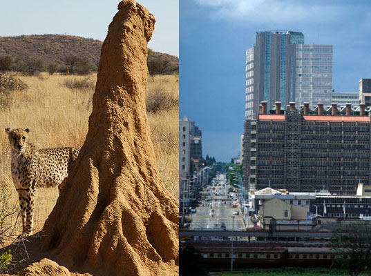 This picture(top right) is of an African termite mound compared to an Eastgate shopping center. Janine Benyus is comparing these structures because like the termite structure, the shopping center is built in such a way that it can maintain a constant temperature just because of the spacing and floorplan of the building. Termites build their tunnels in a specific way so that the their food, which is fungus, can grow. Fungus can only grow at 87 degrees farenheight. So the shopping center mimicked the termites ideas of tall structure.
http://langlor.com/blog/biomimicry-architecture/

This is a diagram of one of Eric Corey Freed's organic architecture. Freed describes his organic architecture as sustainable and natural tools to help the Earth while it helps us. In this machine solar technology is using biomimicry by taking in light in the same way as the leaves of a plant do. This is a very important example of biomimicry because it has to do with sustainability.
http://bloomingrock.com/?p=1343
This structure (top left) was built using digitally enhanced construction and fabrication techniques. It is called "Neural Sky" and was made by a collaboration of architecture students from California in 2010. It is based off of the way neurons are wired in the body. The different legs of the structure transmit information or light to the rest of structure much like neurons are transferred in our body mass.
http://langlor.com/blog/neural-sky/
blog by: Megan Leys
Section D
Sunday, December 5, 2010
Oh the difficulties of art at the Walker..

This is the work of Yves Klein, which is titled: Assemblage of Used Paint Rollers (1956-1962). It is sculpture created using various sized paint rollers encrusted with paint. Visually it captures ones attention through the use of different textures and variation of color and sizes. However, how can this be considered a museum worthy piece of art? To me, it looks exactly like something I can find in a bucket in the corner of my garage. I found this piece to be confusing, thus making it a perfect example of a difficult piece of art which needed to be investigated.
Yves Klein is a French artist that can be classified as either a neo-dada or a post-modernist. Many of his pieces focus on the use of pigment and paint. He calls himself the 'painter of space'. However, he has worked with a vast range of media: photography, music, theater, film, architecture, painting, sculpture, performace, and theoretical writing. Currently his work is being exhibited at the Walker Art Center. The majority of this exhibit focuses on his creation of the color 'International Klein Blue'.
By knowing this, the use of paint and rollers makes much more sense. Klein has such a fascination with color that makes this piece have much more meaning to it than just what the naked eye can observe. Visually this is appealing due to the rhythm and movement created by the paint rollers.
Thank you Yves Klein for puzzling me with your art and giving me a reason to blog about your used paint rollers. It is much appreciated.
Trier's Element

The focus of a lot of my following blog posts will be on the filmmaker Lars von Trier from Denmark.
To give you a little information on him, he is considered to be (by many) the most controversial contemporary filmmaker in the world with such shocking and polarizing films as Antichrist, Dogville, Dancer in the Dark, and (the product of the film movement he co-founded named Dogme 95) The Idiots.
To some, von Trier is a perverse, self-righteous, narcissistic, exploitative madman using the guise of "the artist" to give legitimacy to his self-indulgent drivel. To others, von Trier is the voice of doubt in a world setting where Idealism and percieved Universal Truths and Standards reign supreme.
Whatever your opinions may be on the man, his work is undeniably complex, precise, and difficult. Along with these attributes of his work, his focus on detail and expression of technical skill and prowess is something even his harshest critics cannot deny.
I strongly urge those of you that have not heard of von Trier (which is understandable... his films are rarely shown in America, and CERTAINLY aren't advertised when they are) to investigate him and a few of (what I deem to be) his most important works.
If any of you wish to borrow some of his films, I own them, and would be willing to help you get started.
The film I recommend most to serve as an introduction to his body of work is Europa (1991).
However, if you wish to have a more "crash course" in Lars von Trier's controversy and art, you need look no further than last year's Antichrist... BE WARNED HOWEVER, THAT THIS FILM CONTAINS CONTENT AND IMAGERY OF A NATURE SO EXTREME THAT IT IS VERY LIKELY TO DISTURB, DISGUST, OR CAUSE PSYCHOLOGICAL DISTRESS! THIS IS NO EXHAGGERATION, AND I WANT TO BE PERFECTLY CLEAR THAT THIS FILM IS NOT FOR THOSE WITH DELICATE SENSIBILITIES OR THOSE THAT ARE NOT PREPARED TO VIEW UNCENSORED GRAPHIC VIOLENCE AND SEXUALITY!
I own all of his films, including Antichrist, but several of them cannot go without a word of warning... Antichrist deserves a more special warning, because it is not only the most extreme of his films, but it is quite possibly the most extreme film ever made.
(this is HONESTLY no exhaggeration. When I went to a pre-screening in Chicago, a middle-aged man who had seen his fair share of violent films got up to leave during a particularly graphic sequence and lost conciousness in the isle)
Saturday, December 4, 2010
What Art Should Be by: Jenny M.
We've all been confused by art we have seen at a museum, gallery, or online. "Why the hell is this art? It's SO stupid. I could do that with my eyes closed for Christ's sake!" Sometimes, it's truly frustrating to see art that is worldly successful, while we, as artists, struggle to get our name out. So, the question arises: What do you think art should be, and what shouldn't be considered art? As you'll soon find, it lies in the eye of the beholder...
When first considering art, people often think of "high art" and "low art." Some things are just easier to classify as art, such as the Da Vinci's Mona Lisa, Polykleitos' Doryphoros, or even the Great Pyramids of Egypt. All of these pieces of art were labor intensive, and obviously had a lot of thought put behind them. They would, by many people, be considered high art. These people had extensive training in their field. Now, on the other hand, some people would consider Jackson Pollock, Mark Rothko, or Marcel Duchamp harder to consider high or true art. The issue with Pollock is that he merely took buckets of paint and splatter painted the hell out of them, Rothko just painted two or three squares on a canvas and said it was emotional, and Duchamp took a goddamn urinal and wrote "R. Mutt" on it. With these artists, the average person has much more difficulty grasping these pieces as art. It is essential with these contemporary artist that the viewer is informed of the message(s) these artists were trying to convey. Without Jackson Pollock, are perception of what is art would not have been tested, or the concept that anyone can make art. With Rothko, his pieces were meant to be about the "physical world conflicted with the sublime idea of the universal, supernatural "spirit of myth" (Gardner 1080). It is a simple expression of a complex thought. Again, it is paramount that one understands the meaning behind the art to fully understand it--to see it as art! And, with Marcel Duchamp, he wanted to challenge--no, destroy--the way we make and see art. He didn't even make the art. That wasn't seen as important. It was the fact that he chose it. He took something ordinary, with an everyday use, and placed it in an art exhibition to show it in a new light, with new meaning, and significance; it's normal function being lost, therefore creating a new thought for the object. He certainly changed what we used to consider art (and it being actually made by the artist too).
So, as it has already been mentioned, there are two forms of how we see art: high and low. However, regardless of some viewer's trouble in seeing particular pieces as art, there is usually a greater thought behind the art. Art is something that is either created by someone, evokes a emotional response or feeling, and is either beautiful or hideous. Art comes in so many forms. And there will always be art that challenges us, confuses us, and even angers us (two words: Sherrie Levine), but that response is wonderful. That conversation that begins with an artist creating difficult art opens new conversations to what we consider as art. And with such art, art can continue to grow, and flourish, not die. But instead, thrive on.
Friday, December 3, 2010
Difficult Art at the Walker


http://www.artsconnected.org/resource/91020/die-grossen-blauen-pferde-the-large-blue-horses
Sometimes art makes me mad. It can seem like the artsist didnt care about thier own work or like the artist was jacked up on all sorts of drugs. Thats how I feel about Franz Marc, Die grossen blauen Pferde (The Large Blue Horses), 1911. I dont really see the beauty of this piece. It was confusing and seemed plain stupid. so I did a little research and found out that Franz Marc was in a group of artists called the blaue reiter (blue rider) and thier goal was to paint the thoughts of the inner mind instead of the real world. Marc used the curved lines and blue color of the horses to symbolize a closeness to nature. Maybe its just because this was painted in 1911 and i wasnt born until 1991, but i just dont care for it at all.
Designer Site Visit
So awhile ago we visited the studios of Anne M Cramer and woychick design as a class and overall the visit was pretty good. The day started at Anne's studio with an abundance of snacks such as m&m's, candy bars, and lots of pop. Needless to say I very much appreciated her kindness, and what she said about the fasion design world was eye opening. I am by no means an expert at that sort of thing. She was peppy and seemed genuinely excited to talk to us which was great, a good way to start the day. Then our group went down the block to visit Dan woychick at his studio. He is a graphic designer and works with a lot of non-profit groups like the red cross. he was a laid back guy who has a lot of expirience in the field. The day was pretty enjoyable as a whole, i learned a lot and appreciated the expirience.
Thursday, December 2, 2010
nicole post 1

Steven Stahlberg's "One Last Time" conveys the sense of impending death of the young girl by the monster which encircles her. This work is completed digitally, and displays Stahlberg's masterful skill in the digital arts.
Subscribe to:
Posts (Atom)