Welcome!

Class blog for Orientation to Art and Design, Sections A and D.

Tuesday, November 30, 2010

Fonts

This Walt Disney font is one of my most favorites. It reminds me of my childhood.. I was, and still am, in love with Disney movies. It doesn't necessarily make me giggle out loud or anything. But it definitely does not put a frown on my face.
This font isn't exactly used in everyday typing. It
is used for a certain logo and promotion towards Walt Disney.
Anyone can recognize this font in a heartbeat, mostly from the W and the D (obviously.) It's not a professional type of font, either. It's more playful and most likely could be used in some sort of children's circumstance.


The closest thing I could find for a title is
"Dead Celebrities Made Out of
Fonts."

I'm not exactly sure what type of font was used. The reason I picked these images, is because they're very intriguing. It
's unique and fun. These pictures are also on the happy side. They create a lively spirit, and it is obviously mimicking famous celebrities that have passed.
Other than posting these images throughout the web and on posters/other entertainment reasons, there is no use for these pictures. The font itself is actually composed of multiple types--manipulating the style, fluidity, and placement to create an accurate image of a celebrity.


Century Gothic. My favorite of the standard fonts. It's a geometric sans-serif typeface designed for Monotype Imaging. This font also resembles "Futura," another simple font. It reminds me of something simple, yet interesting. Just like a lot of
my own art work can be. I like the simple things-- none of the
curlies in the typing such as Times New Roman, Arial, and so on. It's there, I get it, let's type with it. This kind of font isn't generally used in books, promotional fonts, etc. It's used in simple everyday things such as an email, picture captions, letters, and other basic websites. It's not necessarily unique, but it's still plain and easy to look at.


Monday, November 29, 2010

Hybridization- the new black?

Greetings on this soggy post Thanksgiving Monday!
I hope you all had a great T Day and are ready to dive into the final stretch of OAD..

Zebroid, courtesy ODDEE.com
HYBRIDS...

Mercedes Hyper concept courtesy PHYSORG.com
If you google this term, you can come up with everything from animals, (some of my favorites being the Schnoodle (Schnauzer and Poodle) and the Zebroid, or  Zorse -combinations of the zebra and the horse) to hybrid bikes to the new brands of hybrid cars rolling off the assembly line quicker than a striped lizard on hot 
asphalt.  


This week we will be taking a brief look at hybrid art forms.  Some of you may remember this term from our discussions during our WAC tour, in reference to works that combine several technologies and media to create a new genre or artform.  We will be touching on this term as it is being and has been used in several art genres, from public artworks to sculpture and performance to early examples of hybrid installations.  So once again, bring your laptops (research) and process journals (to jot down artists and ideas...) as well as an open mind for our discussion. 
But before we launch into this new query, we will take a few minutes to discuss the readings from the last few very busy weeks.  Bring two questions to contribute to our discussion of the Stewart readings (Ch. 5-8) and/or Barrett, Ch. 6, Writing about Art.  We will also de-brief from our action packed  class discussion/presentation on 'Difficult Art' during our last session, so if you missed the show, you need to check out the pdf version of the presentation I've uploaded as a Google Doc for you asap... 


This week's art-junk question may best be answered in a review of the material covered in the last few weeks.  Here goes...
  • Which artist from the 1990s combined text and image to comment on culture and society? (and worked at Conde Nast Publications?)
Good luck, stay dry, and finish your blogs! See you Thursday, if not before...

heading into the final countdown...

The Walker

I chose to write about the piece by Nelson Leirner titled "Homenagem a Fontana II". This piece is very interesting to me. It is so simple that it almost doesn't make any sense. It is just different layers of different colored fabric all with horizontal zippers. Doing some research I learned that Nelson Leirner has always been interested in challenging the way people see art and the way people give commercial value to arranged objects. Leirner was inspired heavily by Lucio Fontana, an Italian artist who was famous for his cut canvases. He would take large canvases, and do nothing but put large gashes in them and show it as art. After knowing this history, it makes it a little easier to understand Leirner's piece "Homenagem a Fontana II" (which translates to "Homage to Fontana II".

Biomimicry

Gecko Tape is a fairly recent invention that uses nanoscopic hairs like those found on the feet of gecko's. The millions of nanoscopic hairs are flexible and produce "Van Der Waals" force upon surfaces creating an adhesive effect. The most useful applications will be underwater and zero gravity use.

Another current example of Biomimicry is Self-Healing Plastics. Much like the way a body can produce scabs and scars to re-heal itself, they are working on plastics that can do the same thing. They use hollow fibers filled with epoxy resin so that if damaged, they would release the epoxy resin which would heal and dry into a material nearly just as strong as the original. They are working on developing these materials further to be used for automobiles, airplanes and even spacecraft.

One more amazing biomimicry advancement is the Bionic Car. The company DaimlerChrystler has created a new car concept for Mercedes-Benz. This car is shaped after a strange tropical fish. They have achieved aerodynamics that cause 20% less fuel consumption and up to 80% less nitrogen oxide emissions. This car runs on biodiesel and would get about 70 miles to the gallon. They are still working on this car and hope it to be released sometime in the near future.

Sunday, November 28, 2010

Yves Klein: Into the Void

image from: The Walker Art Center- Yves Klein: With the Void, Full Powers
October 23 2010 to February 13 2011 Galleries 4, 5, and 6


Yves Klein, European Romanticist and acclaimed Post-Modern artist, sought spiritual insight for viewers, in which he was the medium of revelation. Unlike American action painters, Klein worked to guide the world into the cosmic order. It was in Spain that Klein began painting seriously, with pure pigments, gold leaf, fire, water, and even the female body. Klein worked to combine dramatic flair and tendency toward a more directly physical expression involving the aura of mysticism.

Particularly, Klein worked to suggest experience of the void. Klein sought to create an experience with the void with the use of monochromatic color schemes. He explained, to young critic Pierre Restany that the, "diffusion of energy in space, its stabilization by pure color, and its impregnating effect on sensitivity", were the conclusions in the use of monochromatic color. Klein intended to fix a focus for the cosmic energies traveling through space, and, in 1956, he limited his color palette to blue in an attempt to reach these cosmic energies.

Recently, an Yves Klein exhibit has been placed in the Walker Art Center, located in Minneapolis, Minnesota. Numerous amounts of Klein's work are shown throughout the art center in an exhibition titled, "Yves Klein: With the Void, Full Powers". This was the first, major retrospective, time in 30 years that his work has been shown here in the United States. Paintings, sculptures, drawings, documents, photographs, and films cover a great deal of the Walker, so that viewers may experience the "void".

The Orientation to Art and Design class at the College of Visual Arts, visited the Walker Art Center in pursuits to see the Yves Klein exhibit. I, being apart of the class, had set notions towards Yves Klein through my previous studies of himself as an artist. I had believed Klein was like all other cooky-crazy and post-modern artists, through his unusual compositional choices and use of monochromatic colors. Even with proper studies of his work, I still believed Klein to not be as an impressive as the world had made him out to be. However, the moment I entered the portion of the gallery with Klein's work, I was overwhelmed with so many different emotions. Total bliss had filled my mind and body as I stood in awe starring at his monochromatic work, created in the most brilliant shade of blue. Placed in the center of the gallery was a large installation that contained a tub-like fixture containing gallons upon gallons of blue pigment. The eye-watering coloring is so bold, yet the immense amounts of it bring about a sense of relaxation and serenity. It was then I understood the nature of Klein's work, and felt as if all my studies of him and his philosophical art tied together right before my eyes.

Furthermore, Yves Klein worked throughout his short lived life to stimulate, frighten, and exhilarate viewers through his magnificent spin-off of Post-Modern art. He devised a new way of applying his medium, through the use of the human body, and has challenged viewers to answer the question: What is art? Klein sought to achieve immaterial spirituality through pure color, and after experiencing his work in person, I can properly state that he is a man who has achieved this.


Category, By. "Yves Klein: With the Void, Full Powers." Walker Art Center - Calendar. Web. 29 Nov. 2010. .Web.

Fineberg, Jonathan. Art Since 1940: Strategies of Being. 3rd ed. Upper Saddle River: Prentice Hall, 2000. Print.

"Off Center." Walker Blogs. 05 Oct. 2010. Web. 29 Nov. 2010. . Web.

Tuesday, November 23, 2010

Blog Assign. #7 - Olympic Winners Platform, Coryn L.

During our tour at the Walker Art Center, I hadn't come across the piece entitled, Olympic Winners Platform until the very last second. In those minutes of profound study, the work itself is displayed in a tightly knit yet extremely idealistic fashion.


Olympic Winners Platform, by Tetsumi Kudo (1970-1972) is a 3D post modern work that intertwines the idea of 'hopeful metamorphisis'. The use of aethestic human body parts, a bird cage, and one unified platform is difficult for me to understand and proposes a beautifully threatening idea.

As taken from the Walker Art Center website,

"Olympic Winners Platform was first exhibited at an art festival accompanying the 1972 Munich Olympics. In addition to the universally known Olympic logo, the other graphic symbol represents the brand specific to the Munich edition of the games. Many of the props were repurposed from the film Mire (1970), for which Kudo served as art director. Treating the alienation of modern man, the film was based on a work by absurdist playwright Eugene Ionesco, who ended up clashing with Kudo on the set. The face and body parts seen here represent Ionesco himself: the decomposing fragments of the anti- humanist European intellectual ironically adorn a platform associated with human tenacity and a “community” of nations."

While much of the use of human body parts look chaotic on the platform, the platform itself stands as a 'unity' object, bringing everything in the piece together. The idea of all the nations coming together to participate in a worldwide event also adds to the ingenious idea of unity.

I think what really drew me into this piece was the idea of the antique bird cage sitting above the structure, with the two removed human hands grasping the cage as if clawing to get the plasticine birds inside. The idea of lost freedom comes to mind, of prison, of wanting something you can never have. I love the use of colors in this piece - mixing a sort of bathroom blue with the grotesque rotting green of human skin.


The work may better be understood looking at Kudo's background. After a career in early post-war Japan, he moved to Paris in 1962 where it was said he performed a number of absurd rituals in multidisciplinary events in front of an audience. He is seen as a highly individualistic sculptor and who's work can be described as eccentric, haunting, with the combining use of 'day-glo' colors.

---

Sources:

Olympic Winners Platform, http://www.artsconnected.org/resource/90397/olympic-winners-platform-pollution-olympics-pollution-game-l-art-pressentiment

Olympic Winners Platform, http://collections.walkerart.org/item/object/12381

The Lotus Effect, biomimicry, Coryn L.

The white lotus is a shallow-water, night-blooming plant that floats on the surface. The flowers, up to 10 inches across, remain open until midday. The lotus has extensive uses, including decoration, eating, used for tea, and are also a symbol for spiritual enlightenment. (1.)

It may be no wonder then, that the researchers at the German chemical company BASF are developing a spray-on coating that mimics the way lotus leaves repel water droplets and particles of dirt. The lotus plant, much like the feathers on a duck, have superhydrolic surfaces - meaning that if water falls on them, they bunch up into droplets, and if held at an angle, will roll off with ease. An even greater feat is perhaps that the water droplets that are created upon the surface of the lotus collects dirt, so in a way it's self-cleaning. (2.)

This happens because the lotus plant is covered in microscopic wax crystals. BASF's new achievement mimics the lotus's stunning success by calling it, 'The Lotus Effect'. As taken from nanotech.org,

"BASF's lotus-effect aerosol spray combines nanoparticles with hydrophobic polymers such as polypropylene, polyethylene and waxes. It also includes a propellant gas. As it dries, the coating develops a nanostructure through self-assembly. BASF says that the spray particularly suits rough surfaces such as paper, leather, textiles and masonry: the self-cleaning shoe may soon be a reality." (2.)


BASF even soon hopes to come up with a spray that may even work on much more texturized surfaces, such as sandpaper. BASF calls it 'lotus stone', and many regard it for having great future use in construction, considering the idea of facing tiles.

Making biomimicry ideas come to life, such as the lotus effect, gives way for a brighter and greener future. Creative and intuitive designs, even if a trendy statement, still effortlessly prove to us that earth is priority.


SOURCES

(1.) The Lotus Flower, http://www.kingtutshop.com/freeinfo/Lotus-Flower.htm

(2.) The Lotus Effect Shakes Off Dirt, http://nanotechweb.org/cws/article/tech/16392

Friday, November 19, 2010

Flutter

Flutter 2 from Cinimod Studio on Vimeo.

Wednesday, November 17, 2010

Questions...

Modern Art by Craig Damrauer  photo courtesy Jen Bekman 20 x 200
This week's blog image from Craig Damrauer's New Math series titled Modern Art came to us from Jen Bekman's  20 x 200 blog, a wonderful clearinghouse for new photography and art.   It sums up a couple of conversations begun last week during our tours of the Walker collection (special thanks to tour guides Nancy B. and Misame K...!) These discussions about 'difficult' and challenging work will be continued in class tomorrow afternoon.  A few brave souls have gotten their feet wet on this blog assignment, discussing artworks at the WAC that they found to be challenging disturbing, or just plain difficult to decode.  To the rest of you, my advice is to do a little thinking, a little research, and dive right in!
We will be discussing the tour in class tomorrow, and taking a look at some controversial artworks and issues in contemporary art.  So put your thinking caps on, keep an open mind,and come prepared to debate the issues!

p.s. Seems like no one can figure out the last art junk question. Too bad...
This week's question:  What was Yves Klein's self-proclaimed first artwork? Cmon, a little research never hurt anyone... 


fonts


The Lucida family of typefaces was created by Charles Bigelow and Kris Holmes in 1985. The Lucida family includes many different variations. They have seif's (Lucida Fax, Lucida Bright) and sans-serif's (Lucida Sans, Lucida Sans Unicode, Lucida Grande, Lucida Sans Typewriter) and they have scripts (Lucida Blackletter, Lucida Calligraphy, Lucida Handwriting.) Lucida Bright was used as the text face for Scientific American magazine. I personally think that Lucida Blackletter is the most captivating of the family of typefaces, it is very bold and powerful yet classy at the same time.


src="https://blogger.googleusercontent.com/img/b/R29vZ2xl/AVvXsEhwXLMa_kZZM6R3u4psX77-_RKtF7Kb8z8aUROAqUfGyREm9jyXuYZRs3ikmwVOjbc-G5ueoZ1a104nssNm-gUavZ9IyHZZvRbIn6TNJA3Iww7ZzdrcHWn4Ijwa7XIVU1i2Pis9hYm6gH29/s400/ComicSans.gif" style="float:right; margin:0 0 10px 10px;cursor:pointer; cursor:hand;width: 400px; height: 267px;" border="0" alt="" id="BLOGGER_PHOTO_ID_5540713585785193810" />

Comic Sans is a very well known font. It is based on fonts used in comic books. Comic Sans was designed by Vincent Connare in 1994 and released by the Microsoft Corporation. The use of this font has been an icon for criticism
. Many publishers and writers have been criticized heavily for using Comic
Sans. Especially when the casual font is used out of context in serious matters.
Dan Gilbert, the owner of the Cleveland Cavaliers, was ridiculed heavily when he used Comic Sans in a public letter explaining LeBron James' decision to leave the team.
The board game Defenders of the Realm was laughed at for using Comic Sans on its cards and on the box. Also for using the font in online forums, and the use of the font became an ongoing joke.
On November 5, 2010, USA Today featured a story about Conan O'Brien sporting the Comic Sans font.
The font was also used in a Wall Street Journal editorial written by Scott Adams, the cartoonist who made Dilbert.

Another popular font to play around with is Webdings. Webdings was also created
by Charles Bigelow and Kris Holmes. They created this font in 1990-91 and released it as Microsoft Webdings in 1992. Originally this font was 3 separate fonts, named
Lucida Icons, Lucida Arrows, and Lucida Stars. They created this font to represent the common assortment of icons you encounter through a PC. They include icons for PC, monitor, keyboard, mouse, trackball, hard drive, diskette, tape cassette, printer,

fax, file folders, documents, mail, mailboxes, windows, clipboards and wastebaskets. Also included sybmbols with less computer significance, such as writing tools, hands, reading glasses, clipping scissors, bells, bombs, check boxes, weather signs, religious symbols, astrological signs, encircled numerals, ampersands, interrobangs, flowers, bullets, asterisks, ornaments, geometric circles, squares, polygons, targets and more.

At the Walker- Michelle Stolz


Donald Moffett
1995/2003
Paintings
20.125x16.125x2.25
Walker Art Center
As I was sitting in the binocular room at the Walker, I was immediately drawn to this particular piece, because I did not understand it. It also challenged my idea of art, because when it caught my eye from a distance, I thought it was a plain, grey canvas. After going home and researching more of his works, I began to understand his style more. He makes many paintings that focus on texture, using free-flowing organic shapes, as well as geometric shapes such as square boxes. He also has multiple pieces that deal with text incorporated with the human face, which I found to be the most intriguing.
After researching the piece and the artist, the subject matter is still very unclear to me. The piece is very organic and free-flowing in form, and texture is the most prominent feature of this piece. It is very uncertain and questionable as to what the content and the context of this piece relates to, but it was make in the 1990's. The genre of art that this most likely falls into is post-modernism.
After looking from a distance at the piece, I looked at it closer, and the pre-assumed plain grey canvas morphed into a texture-heavy, three-dimensional painting that confused me. I thought to myself, "what is the point of this piece? It is too simple and it honestly should not be classified as art. It is simply too simple." After going to the information screen located in the binoculars room, I got a closer digital image, and I started to accept the fact that it is indeed art, and that it is craft intensive, and the texture and the-dimensionality is simply amazing. From sitting down and looking at the piece for a good half an hour, it put me in a trance, trying to follow all the free-flowing, fluid lines that formed from the texture of the painting. After looking at it for the amount of time that I did, it started to look like a mangled mess of chains, layers of tiny chain links in a pile. From my observations, I believe the artist is trying to say something about how simplicity can be decieving at first, but after a while, the complexity of it all can become something beautiful. He can also be symbolizing beauty through distress. He shows this by using one simple color, and a complex organic texture.
This piece of art contributes to art history by showing that a piece of art does not have to be elaborate to portray a meaning, and it doesn't have to use fancy brush strokes or realistic figures such as animals or people, it is simply a painting with one color, and a complex pattern. It also defines modern art, and challenges how art is viewed today. Most modern art is more idea based than actually art based, meaning the idea of a great piece is there, but how it is portrayed and finished as an end result is questionable, and Moffett's pieces are certainly questionable at first, but then once the image is observed and researched, the viewer can grow a deeper meaning for it, and apprecaite it even more. Knowing about art pieces makes the viewer appreciate art more, than simply passing by knowing nothing about a piece that fustrates or confuses the viewer, and this is why I personally have developed a love for the Walker, because the more I learn about an artist or a piece of art, I can appreciate it more, or, if not appreciated, I can learn why something confuses me or fustrates me- and this is the beauty of art.

Paul Chan at the Walker - Angela

I was intrigued by Paul Chan's work at the Walker, the 6th Light made in 2007. It is a digital video projection that is 14 minutes in length and gets it's very own small, white painted, room. The viewer walks in to the small room standing toward the top of the projection which is on the floor, the projection is tinted blue while it appears that chunks of shrapnel are breaking apart and moving towards you while gaining speed. The room has a surreal feel and I chose to look into it because I want to understand it and it's artist. 


Paul Chan/6th Light/Walker
Paul Chan is an artist, a writer and a filmmarker, the 6th Light is part of a series of 7 works that depict the 7 days of God's creation from day to night. The film starts with recognizable objects, lamp posts, cell phones, etcetera, and as the film continues the forms become less recognizable and pass by less frequently. This implies dissolution and may be a reference to September 11th and the Last Judgement. 

While in the room I got a sense that it may be been referencing September 11th but I would have never known it was part of a series had I not done a little research! At first it seemed unnerving but after spending some time in this space I enjoyed the surreal feeling. This work and the others in this series are breathtaking, take a look and enjoy! 


Google: Images: Paul Chan

Gene Davis


Gene Davis has a piece in the Walker, 'Untitled' made in 1960, which is the piece I chose to research because at first I didn't understand it. At first I perceived this painting as an illusion, with the black and grey stripes receding in space as it reaches the top and bottom edges of the canvas. Davis is considered an abstract painter and worked in a group of the same style painters, the color abstraction movement, in Washington DC in the 1960s. Davis describes himself as a jazz musician where he "plays by eye" as a musician plays by ear. He describes the importance of the 'color interval' creating a rhythmic effect with the irregular appearance of colors or shades within a composition.


UNTITLED
Gene Davis
1960

Monday, November 15, 2010

Kellerhouse Design


This guy has been hitting the nail on the head as far as design goes for about 5 years in mainstream culture. Neil Kellerhouse is a designer from LA who has done lots of product design and work for film. Starting as a production design assistant for Warner Brothers, he worked his way into the trusted terrain of Pentagram Design before leaving for freelance in LA to work for such filmmakers as Steven Sohderberg, Lars von Trier, along with the humble folks over at the Criterion Collection.

Hope you guys enjoy his work!

http://kellerhouse.com/

Sunday, November 14, 2010

Biomimicry-Katie Hill

Biomimicry is a study of nature and its processes used to inspire solving human problems. Janine Benyus, author of Biomimicry:Innovation by Nature, looks to nature as a "model, measure, and mentor". That is the perfect description for nature's role in biomimicry. Nature plays as a model by showing an example of how the problem should be solved. Nature sets measurements by giving example of what needs to be taken into consideration to solve to the problem. Finally, nature is biomimicry's mentor by proving the correct outcome if the problem has been solved seccessfully. Nature is full of systems an patterns that aid for one another, and solve one another's problems. If we were to look to nature for inspiration for elements of design and creation, the end results will be more successful.


Now, wallowing in your success would not be wourth it unless resting among clouds. Resting among clouds? Is that possible? With Cheng-Tsung Feng and Kai-Ting Lin's Daydreamer it is. The Daydreamer is a series of foam balls connected to create a large pillow for lounging. This ball pillow consists of artificial fur, 9 low-density foam balls, 40 high-density foam balls, and canvas. The foam balls are made to move around and adjust to how the user wishes to lie upon them. The Daydreamer can become a couch, bed, or any arrangement used for lounging. This ball pillow was made to feel as if lying on a cloud, which is exactly what it does. A cloud serves as a model because it looks like a cloud and forms to the user as they please. A cloud shows measurement of how comfortable the ball pillow should be. Finally, a cloud is the perfect mentor for this ball pillow because everyone dreams of lying on a cloud. Using a cloud as a problem solver for the perfect lounge area is a great way of using biomimicry.


Unlike the Daydreamer, the next item does not exactly problem solve, yet it does show much inspiration from nature. The UK pavilion was invented by Thomas Heatherwick, presented at the Shanghai expo of 2010. The pavilion has long rods shooting out of the outside. These rods extend into the inside and on the ends are cased in seeds creating a seed cathedral. These long rods sway in response to wind and collect any light source from the sun in order to act as a fibre optic filaments that light up the inside aswell. At night the structure glows from the interior. The long rods on the outside wave around like cilia, cilia can be used as protection for a cell. What I have imagined as the purpose of the structure is to show how the cilia protects the inside seeds. Through the celia, only light is captured, which makes the seeds encasement glow. The glowing of the seeds represents life and the light captured in the cilia represents energy. Only energy is needed to make this seed cathedral alive, energy is the only thing that the cilia (rods) allow into the pavilion, hence protection against anything else. Though this does not exactly require a model, measure, and mentor from nature, the pavilion still represents a design that used many inspirations from nature.
For my last example I wanted to show somthing a little bit different. Biomimicry is a fantastic way of showing art aswell as design. A lot of artists use nature to inspire their work and how they go about making their work. Biomimicry can also be shown through music. I've found this song called "Bio-mimicry" by Loves' Destiny. This piece uses different sounds of nature put together to make a song, except for the background melody and the snare that kicks in at about 1 minute and 41 seconds but the song returns to the sounds of nature after 2 minutes and 31 seconds. At the beginning there are faint bird noises that create a calm sense, followed by a light breeze, almost silent, but intriguing. Then, the sounds of a forest builds the listener up to the climax of snares, which then dies down again to an almost silent noise.
Also two other websites that show a lot of biomimicry in their architecture are:
(I would've used these as examples but they did not have much information)
this song was posted on:

Sluggestion Sec. 1.34

...Someone should use this for their biomimicry post..
or just read about it. It's really awesome.

http://www.greenmuze.com/art/artists/3127-weather-data-woven-art.html

Biomimicry_Jeremy A

Biomimicry is the examination and study of nature and its models, systems, processes, and elements to simulate or take inspiration from in order to solve human problems. The examples I chose to use are all used in artwork, and are very fascinating if you didn't know.

This instillation is from Choi Jeong Hwa's "Aomoria Instillation' at Towada Art Center. Choi Jeong Hwa is a Beijing based Korean artist who uses biomimicry in everyday objects to explore the depressing absence of nature that's growing in our society. He has used biomimicry to create many sustainable art installations spanning almost every continent.


This next light instillation entitled "Liquid Light" was created by Canadian artist Tanya Clarke to emphasize the importance of conserving water. It was made using old plumbing fixtures, LED lights, and various found objects combined with beautiful little handmade glass droplets.


This final sculpture cleverly called the "Giant Flip Flop Monkey Sculpture" is located in San Paulo, Brazil. It was made from thousands of pairs of recycled flip flops by local art students for a community art project. This project was made to spread the word on the importance of recycling and not littering.

A lesser known goal for this sculpture was to harvest a giant brain and all the most important organs from some unsuspecting fool and implant them into the flip flop
monkey. Brazil would then use this terrifying giant to rule the galaxy. Results on the hunt for a giant brain are scattered, but will be updated shortly.

Fonts.

APPLEGOTHIC:

Applegothic is a font that comes as a standard font on all Macs. It is a very clean and simple font. The letters have a horizontal emphasis, both upper or lower case. The characters are very round and have a middle center of gravity. It can sometimes be confused with Ariel. However, compared to Ariel, it is more compact.

ARWEN:

Arwen is a large font in which all of the characters are uppercase. This is a light font, but does have weight on the left-most part of the letter. It does not contain serifs, thus creating a sharp, bold look. The best use of Arwen would be for graphic design purposes.


CALIFORNYA:


Califoryna is based off of 16th century manuscripts. Each character looks handwritten, making each one unique. It is based off of traditional calligraphy, but is more loose and has more character. One might find this more difficult to read than a traditional font. This is best used as a decorative font because of this.

Saturday, November 13, 2010

By O Me. My Cree!

Biomimicry and sustainable art. Freaking cool stuff!! But also freaking hard to research, at least for me. Maybe my research tools fail me though.
So I stumbled upon this company called Redwood, and they aren't exactly the most exciting company and they sure don't make Pokemon games but they are making some pretty innovative stuff. They're company revolves around lighting. Instead of using the standard AC lights that is in pretty much every household, they resort to using energy efficient LED lighting. Doesn't sound that innovative does it? Well it goes a bit farther. Since LED lights focus around temperature they can make really great sensors. In this they can sense when people are in the rooms and they can turn on and off when they are there and they can also read how much external light is coming into the room and maybe turn down the amount of lighting in the room. Somewhat neat. Obviously this would be an extreme energy reducer and that's the strong appeal. If we could see a prototype of what these lights look like. I think that this great idea needs to have aesthetic design that goes with the LED lighting, but unfortunately I don't have any type of example. Sad day!

Here's another simple idea that could definitely make a difference in a problem of the air travel gas consumption. So you know that birds travel in a V-shape pattern and apparently that boosts their distance to fly by 70%. Some smart people from Stanford believe that if we did the same thing with our airplanes that it would decrease fuel consumption. Woo hoo! Hey that doesn't even require much except careful flying patterns. This is a great design idea because of the fact that it doesn't require extra building or added materials. In fact it almost doesn't fit into design because it's just smarter travel rather than some sort of remade product. However I suppose it is a remade idea.

Ok Ok. So I haven't been totally excited about the last two. Although they did do some good things for society I felt like they weren't great aesthetically or they weren't that revolutionary. This next one takes a step up. PAX scientists have taken a long hard look at repeated design in nature.
The Fibonacci sequence. Seen in tails of the chameleons, the trunk of an elephant, and in the obvious shell, this design must be some sort of masterpiece of mother nature, something that she likes to flaunt. PAX scientists have begun to take after mother nature and started applying it to human made rotary devices like fans, mixers, propellers, turbines, pumps, etc. According to Biomimicry Institute, it can reduce energy usage 10-85% and noise up to 70%. That's AMAZING!! This actually does get me excited. Considering that this has been used in nature so much it makes it a great design efficiency wise. However, what gets me so excited is the actual design itself. It's a beautiful shape all around and it can be adapted and rearranged in so many ways that its one of the most fun shapes as well. This is truly a genius idea because not only does it satisfy one our biggest issues but it also feeds into our amazing need for aesthetics. My artistic wants are pumping and breaking apart the seams. Their are so many ways that this idea can be implemented into rotaries and it fits so perfectly. The beauty of this design is that every aspect of the design works with each other. It's useful and it looks good. O my favorite!!

http://greenagenda.info
http://www.mnn.com
http://www.biomimicryinstitute.org/

Fonts- Katie Hill (section D)


Kremlin Alexander font was created by Bolt Cutter Design-Industrial Strength. This type of font is bold, mostly in capitols, except for some letters; a,r, and n appear to be in lowercase. Lowercase and uppercase are both the same height, this shows that either of the two types can be used anywhere in a word or phrase. The style of the font looks as if a Russian view of an Old English font. They both use thick bold lines and thin lines aswell. This font is probably not used for professional use, rather it is primarily for decorative use. This bold text has a sense of strength behind it that would make any phrase bold and blunt. The bluntness of the text is intimidating to any reader and would be best used for advertisement that implies seriousness.


Steeltongs font was created by TracerTong. This font is made of up of tall, skinny, capitol letters. The letters remane in monospace, meaning that all of the letters share the same width. Though the letters are not as thick or bold as Kremlin Alexander they still portray a blunt context. This blunt context derives from the monospace and capitol lettering. This reminds me of futuristic texts because the lettering has very slight curves if any and the long skinny letters represent mechanical gestures, which is robotic, hence futuristic. This font makes you feel intimidated yet informed. Which is the main purpose for what this is used for, credits for movies on their posters and video cases. This can also be seen for movie titles aswell.


Uncle Typewriter was created by Typo 5. This is an obvious typewriter font with a scarier twist on it. The font appears in all lowercase lettering but some of the letters are larger than others. With some of the letters being at different size it puts an emphasis on a different part of the word rather than always the beginning. In the background there is blotchiness that represents age on the font. The thick sloppiness is what seems to make the font more scary or morbid. This type is intimidating in a whole other sense. The first two fonts were intimidating how they were bold and blunt, this font is less blunt but more creepy. The first two fonts were also secure in where they stand, in the Uncle Typewriter font the letters float around more which makes the reader almost seem uneasy from the just looking at the font. This font could best be used to set a scary mood to anyone. Also used for primarily decorative uses could be for books, movies, posters, almost any design use.

Friday, November 12, 2010

Before the Sun- Sarah Lerum

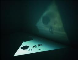
Karthik Pandian is a contemporary artist who lives in Los Angeles. Recently his work has been shown at Midway Contemporary Art in Minneapolis, but his work has also been shown nation wide. The exhibition he did at Midway was an architecture and film piece. The structure was a large square of packed earth. The sides of the platform has sea shells flush with the packed earth. There were two 16mm film projectors housed in two class columns. These columns were lined up so the front of the projector was towards where the two walls of each corner met. The room was very dark because both of the projectors were playing at the corner of each side of the room. The film was repeated for both projectors. One side was the sunrise and the other was the sunset; they both also had other clips, such as, the beach, people, and fireworks. In addition to this exhibition, there was audio playing, which were the sounds from what was recored and playing on the film.

Anne Cramer- Sarah Lerum

On Thursday, October 28th our class visited Anne M. Cramer. Anne is a fashion designer in Minneapolis. I wasn't too sure how interested I would be because i'm intending to be a graphic designer, but i was completely blown away by anne and her techniques. Anne is a very humble and wonderful. As she told us her story and process to get to where she is now, I became more and more interested. She said that she is a procrastinator, and it works very well for her. She said she could be given months to do something but wont do it until almost the week before; that's when she's the most creative. All of Anne's work is very unique and it might not be everyones style, but that's what fashion is all about. I never wanted my own graphic design business until we visited Anne, but after listening to Anne, I now want my own business. Anne has inspired me to push myself and work for myself and no one else.

Yves Klein: Strange, Yet Brillant

I've chosen Yves Klein and his "Anthropometries of the Blue Period" to write about. Upon first seeing the video of him directing women to paint their bodies, and press themselves against the immense canavas, well, it was simply bewildering! It was so elegantly done, as if a performance of a play on stage, with music accompanying, and an audience watching all the while. Yet, my face kept frowning as I watched more and more. "How strange," I uttered to myself. This was something completely new to me, and needed further investigating.

                             Klein and model during the performance of, "Anthropometries of the Blue Epoch,"March 9th, 1960

Klein was born in 1947 in Nice, France. Early on in his career, he was drawn to the concept of boundless space and time, as well as the "immaterial" where one could exist, live, be without worrying about the burden or weight of objects. Although he died at the young age of 34, his short career proved productive and abundant. His use of ultramarine blue during the Blue Period was given a name all his own: International Klein Blue. His reasoning for using blue was that it represented compete freedom, abandonment of any reference to the languages of representation, and the color has the spirit of the sky and sea all in one. It's amazing that one color can exemplify two such boundless forms, one of the water, and one of the air.

In his series of Anthropometries, as stated earlier, the women press their already blue covered bodies against a canvas. Klein did not see them as blue covered women, he saw them instead as "living brushes." He wanted to stray away from the usual paint brush or medium utilized at the time by artists, and instead use something alive that could transfer that energy and leave an imprint behind. This is why the performance aspect of the Blue Period was so vastly paramount. The act of the painting was fleeting, ephemeral. The imprints of the women left behind suggests what used to be or what already happened. Klein even called his art works the "ashes" of his art, implying that they were traces left behind from a greater desire.

After being further informed about Yves Klein (having external data), I realized his aspirations, and finally got it. His art was a performance that took place for such a short amount of time in history. He wanted to document it, and leave a shell, a small trace behind so people could find it, and be taught something new. His work at first may confuse the viewer, and make them question the legitimacy of the art, but it truly provokes deep thought by having the viewer question it. At first, I greatly disliked his pieces, but now, they mean so much more. That is why in viewing contemporary art work it is important to further inform one's self. Once you understand the piece of art, and the desired message the artist wished to convey, you can truly appreciate what you see before you.

Sources:
http://calitreview.com/9415
The Walker Arts Center

Thursday, November 11, 2010

Blog number 7 Megan Leys Section D

This is called "For Emily Dickinson" by the artist Joseph Cornell and it is on display at the Walker Arts Center. It was made in 1965 in America and is made with:Drawings and Watercolors, Unique Works on Paper, Mixed media | collaged reproduction, Masonite, plexiglass, wood, and brass screws

Joseph Cornell was born on December 1st in 1903 in Nyack, NY and dies on December 29th, 1972. He was most known for his constructions, poetry, and experimental films.

I'm questioning this piece not because I don't like it or don't understand the image, but why it is called contemporary art. The artist was alive for the beginning of contemporary art that is popular today, but this piece seems like a photomontage at first glance, so I was questioning why it was in a place like the Walker Art Center.
But I think the answer is that this doesnt look like the contemporary art style but after i did some research i found that the artist used a lot more tools to make this than a photomontage. So this piece almost seems like more of a construction than a photograph.


Work Cited:
http://artsconnected.org/resource/81402/3/for-emily-dickinson

Sustainable Art and Biomimicry


Biomimicry looks to nature, as well as natural systems, for inspirations in new design problems. Mother Nature, prospectively the greatest designer of all, gives insight to designers to solve modern day design problems. Engineers and designers then work along side each other to create a solution in our world through applying certain aspects of nature to designs.

For example, designers have studied the beautiful butterfly in specific examination of its wings. Butterflies possess some of the most striking colors found in nature. Butterflies receive their color from two different sources: pigmented color and structural color. The ordinary color comes from normal chemical pigments that absorb certain wavelengths of light and reflect others (Horton).The Qualcomm company has taken this principle from the butterfly and has developed "Mirasol Displays". The mirasol displays mimic the way light reflects from the scales on a butterflies' wing. The Qualcomm company makes use of the reflected light principle with an understanding of how human beings perceive that this type of light. Using an interferometric modulator [IMOD] element in a two-plate conductive system, the display uses near-zero power whenever the displayed image is static while at the same time offering a refresh rate fast enough for video (brainz.org). This concept is perfect for hand-held devices and is a great battery-saver !

Another great example of biomimicry comes all the way from Zimbabwe, where designers have built a high rise building, "The Eastgate Centre Building". This building was designed to mimc the towers built by termites in Africa. These termites build towers that maintain a constant temperature by constantly opening and closing vents throughout the mound to manage currents of air. The Eastgate Centre building uses similar design and air circulation and in doing so, they consume less than 10% of energy used in similar sized convention buildings !


For my third and final example of biomimicry, I have chosen to look at the invention of swiss engineer " George de Mestral. In 1941, Mestral invented the every popular velcro. Mestral used biomimicry to create the design of velcro through studies of his dog and the way that burs monstrously stuck to his dog's hair. Mestral noticed, through the use of a microscope, that the burrs' tiny hooks stuck to anything with a loop, such as his dog's hair. Mestral than created a 2-part velcro system that consisted of strips of hooked material and strips of loosely woven nylon that held the hooks.

-Katelyn White


http://animals.howstuffworks.com/insects/butterfly-colors.htm/printable : Jennifer Horton
http://brainz.org/15-coolest-cases-biomimicry/