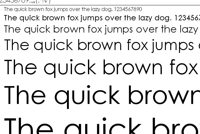
Century Gothic:
Century Gothic is, according to Wikipedia: 'A geometric sans-serif typeface designed for Monotype Imaging in 1991'. It has even stroke-width and is used frequently in advertisements for chic designs and more urban companies. You may recognize it from the show Ellen, the Canadian music duo Crystal Castles, and the GMA network. When I look at century gothic, my eye reads it as 'chic', new age and fashionable. The smoothness of the typeface is skinny and not as bold as others, making it seem feather-like while maintaining some sort of stability through the strict vertical lines of the strokes. It reminds me of clothes, fashion, fashion logos while being highly appealing to a more integrated crowd. It makes me feel classic, yet new age while straying from being too generalized. I think this font can best be used for advertising a design, a product directed to a younger female crowd.
Bank Gothic:
Bank Gothic is a rectilinear geometric sans-serif typeface. It's more futuristic design looks incredibly new age, but it was actually designed in 1930 by Morris Benton for the American Type Founders.
Immediately upon looking at Bank Gothic I see a science-fiction theme, bolder words with more length into the horizontal lines than vertical lines, wider letters and noble undertones. It makes me feel that Bank Gothic is attempting to make a rather daring impression upon the reader/viewer, that may be whatever is being written is 'epic' and important, or highly sophisticated. I think it can be best used for higher stature companies, or even so, movie headlines.

------------------------------------------------------------------------------------------
Goudy Old Style:
This font is a serif typeface, old-style and classic developed in 1915. It is also known as simply ' Goudy '. This font has a universal feel of English-style literature, or fertile American land, and makes me feel as if I'm reading a classic. The type of font you might need to brush some dust off of, even if it's still used widely today. I think this font can best be used as an eternal placement of something - such as a gravestone, or an engraving into stone. The agelessness of this font repeats the sophisticated styles of typography while remaining a decent choice for any serif typeface.

---------------------------------------------------------------
Sources:
http://en.wikipedia.org/wiki/Goudy_Old_Style
http://en.wikipedia.org/wiki/Bank_Gothic
http://en.wikipedia.org/wiki/Century_Gothic
Nice work, Coryn...and I appreciate the added information.
ReplyDelete